
How to Increase Website Conversions: 2026 Guide

What actually moves the needle on website conversions?
The fastest way to increase website conversions is to fix the elements visitors encounter before they ever reach your checkout or contact form: your value proposition, your page speed, and your calls to action. Most sites lose conversions not because of weak products but because of friction, vague messaging, and misplaced trust signals. The strategies below are ranked by impact and can be applied immediately, whether you run an e-commerce store, a SaaS product, or a professional services site.
Top strategies to implement right now:
- Sharpen your value proposition. Visitors decide within seconds whether your offer is worth their attention. Lead with a specific benefit, not a category description.
- Run A/B tests on high-traffic pages. Test one element at a time: headlines, CTA button copy, or form length. Small changes compound fast.
- Place social proof at decision points. Testimonials buried on an “About” page do almost nothing. Position them near your CTA, on product pages, and at checkout.
- Reduce form fields. Every unnecessary field is a reason to leave. Ask only for what you genuinely need to move the conversation forward.
- Improve page load speed. 53% of mobile users abandon a site that takes longer than three seconds to load. Speed is a conversion lever, not just a technical metric.
- Write CTAs that name the action. “Get My Custom Quote” outperforms “Submit” because it tells visitors exactly what happens next.
- Use exit-intent popups at checkout. A well-timed offer, such as free shipping or a limited discount, can recover visitors who are about to leave.
- Segment and personalize email sequences. Behavior-based nurture flows convert prospects who were not ready to buy on their first visit.
- Benchmark against your industry. Knowing where you stand helps you set realistic goals and identify the gaps worth closing first.
Pro Tip: Place your strongest testimonial or case study result directly above your primary CTA, not in a separate section. Visitors who see social proof at the exact moment they are deciding whether to click convert at a measurably higher rate.
How does A/B testing actually improve conversion rates?
A/B testing is the most reliable method for removing guesswork from conversion rate optimization (CRO). The premise is simple: you create two versions of a page element, split your traffic between them, and let the data tell you which version performs better. The discipline is in the setup.
Start by defining a specific goal tied to a conversion metric, such as add-to-cart rate, form submissions, or checkout completions. Without a defined goal, you cannot interpret results meaningfully. Then choose one element to test at a time: a headline, a CTA button label, a hero image, or a form layout. Testing multiple changes simultaneously makes it impossible to know which variable drove the result.
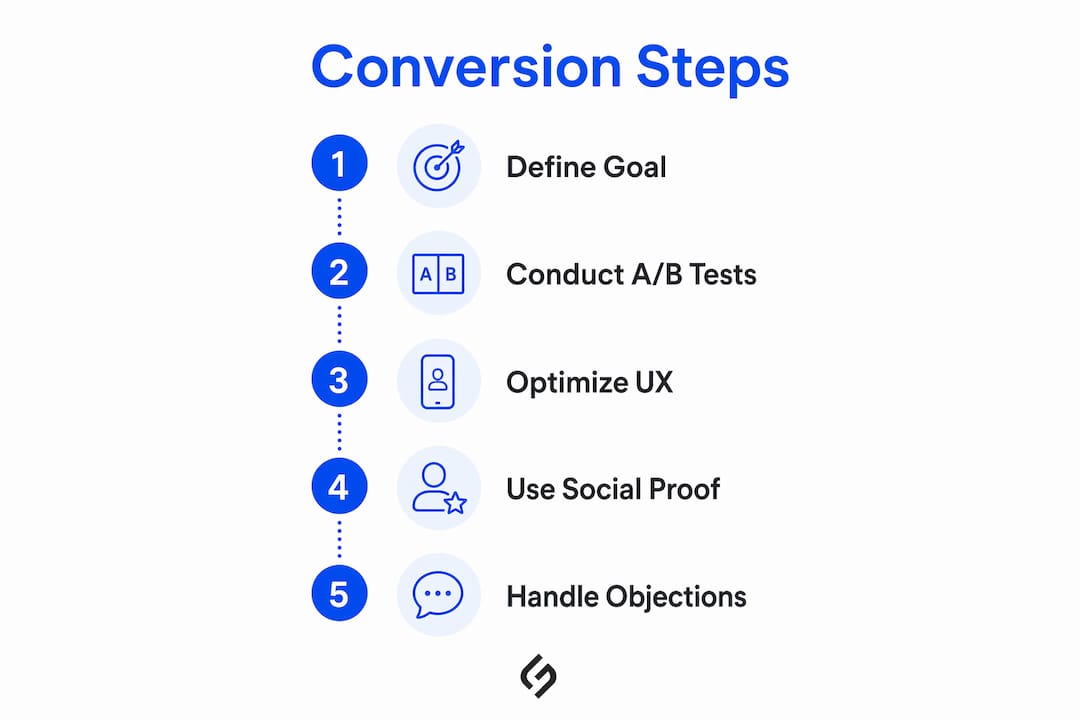
A/B tests should run for at least two weeks before you draw conclusions. Running a test for three days and declaring a winner is one of the most common mistakes in CRO. Traffic volume matters too: a test on a page that receives 50 visits per day will take far longer to reach statistical significance than one on a page with 5,000 daily visitors.
Elements worth testing on most sites:
- Headline copy and subheadline framing
- CTA button text, color, and placement
- Hero image or video versus static graphic
- Form length and field order
- Pricing page layout and plan hierarchy
- Trust badge placement relative to the CTA
Pro Tip: Build your test hypothesis from user behavior data, not intuition. If heatmap data from a tool like Microsoft Clarity shows that visitors are not scrolling past the fold, your first test should be moving your CTA above that fold, not changing its color.
What makes a value proposition actually convert visitors?
A value proposition is the single clearest statement of why a visitor should choose you over every alternative. It is not a tagline. It is not a mission statement. It is a direct answer to the question every visitor asks silently: “What do I get, and why should I trust you to deliver it?”
The difference between a weak and a strong value proposition is specificity. “We help businesses grow” tells a visitor nothing. “We cut your reporting time by five hours a week with automated dashboards” tells them exactly what changes in their life if they buy. Benefit-focused language consistently outperforms feature-focused language because it answers the visitor’s real question: what is in it for me?
Characteristics of a high-converting value proposition:
- Leads with the primary benefit, not the product category
- Uses the visitor’s own language, drawn from reviews or support tickets
- Appears above the fold on every key landing page
- Is reinforced by a supporting subheadline that addresses the most common objection
- Avoids jargon that requires industry knowledge to decode
Placement matters as much as wording. Your value proposition should appear in the hero section of your homepage, at the top of each product or service page, and in the subject line of your first email to new subscribers. Visitors who land on a page from a paid ad expect the headline to match the ad copy they clicked. When it does not, they leave. When it does, targeted messaging increases conversions by reinforcing the promise that brought them there.
Refine your value proposition by testing it against objections. If price is a common concern, your value proposition should address long-term ROI. If complexity is the worry, it should emphasize ease of setup or available support.
How do you build a sales funnel that actually converts?
A sales funnel maps the path a visitor takes from first contact to completed conversion. Most sites have one, but few have one that is deliberately optimized at each stage. The three core stages are awareness, consideration, and decision, and each requires different content, different CTAs, and different trust signals.
At the awareness stage, visitors are identifying a problem. Blog posts, SEO-driven landing pages, and educational content serve this stage. The goal is not to sell but to establish credibility and capture an email address or a retargeting cookie. At the consideration stage, visitors are evaluating options. Comparison pages, case studies, and detailed product pages do the work here. This is where behavior-based email sequences become critical: a well-timed nurture flow that addresses common objections can move a prospect from “maybe” to “yes” without any additional ad spend.
Funnel optimization checklist:
- Map your current funnel using Google Analytics or a similar analytics platform to identify where visitors drop off
- Assign a specific CTA to each stage: “Download the guide” at awareness, “See how it works” at consideration, “Start your free trial” at decision
- Set up abandoned cart email sequences triggered within one hour of abandonment
- Use retargeting ads to re-engage visitors who reached the consideration stage but did not convert
- Integrate your CRM with your website so lead behavior informs your follow-up messaging
The most common funnel failure is treating every visitor the same. A first-time visitor from organic search needs different messaging than a returning visitor who already viewed your pricing page. Smart CRM integration with your website allows you to personalize the experience based on where each visitor is in the buying process, which is one of the highest-leverage changes a business can make to its conversion infrastructure.
Where should you place social proof for maximum impact?
Social proof works because people look to others when making decisions under uncertainty. The mistake most sites make is treating social proof as decoration: a testimonials page that nobody visits, or a logo bar that sits below the fold. Strategically placed social proof reduces purchase anxiety at the exact moment it peaks.
Embedding testimonials and case studies near checkout rather than burying them on a separate page is one of the most consistently recommended tactics in CRO. The logic is straightforward: anxiety is highest when a visitor is about to enter payment details. A specific, named testimonial at that point provides the reassurance that tips the decision.
Types of social proof and where to use them:
- Customer testimonials with full names and photos: Product pages, checkout page, and pricing page
- Case studies with specific results: Consideration-stage landing pages and email sequences
- User-generated content and reviews: Product pages and category pages
- Trust badges (secure checkout icons, SSL certificates, payment logos): Checkout page and any page with a form
- Review counts and star ratings: Homepage hero section and product listings
- Client logos: Homepage and service pages targeting enterprise buyers
Trust signals like secure checkout icons and clear pricing reduce cart abandonment by addressing the two most common late-stage objections: “Is this site safe?” and “Are there hidden fees?” Both questions are answered before the visitor has to ask them.
What UX and design changes improve conversion rates most?
User experience is where conversion rate optimization and web design overlap most directly. A visitor who cannot find what they need within a few seconds will leave, regardless of how strong your offer is. Clean, intuitive layouts with clear navigation are the baseline; everything else builds on that foundation.

Page load speed is the most measurable UX factor. Mobile devices accounted for the majority of all website traffic in Q2 2025, which means a slow mobile experience is not a niche problem. Google recommends a page load speed of under 2.5 seconds. Compressing images, using a content delivery network, and enabling browser caching are the three fastest ways to close the gap. For a deeper technical audit, Solution4guru’s website performance optimization resources cover both front-end and server-side improvements.
UX improvements ranked by conversion impact:
- Move your primary CTA above the fold on key landing pages
- Use high-contrast button colors that stand out from the surrounding design
- Eliminate navigation links from dedicated landing pages to keep visitors focused
- Apply consistent whitespace to reduce visual clutter and guide the eye toward the CTA
- Use a progress indicator on multi-step forms and checkouts so visitors know how close they are to finishing
- Test your site on actual mobile devices, not just a browser emulator
Pro Tip: Heatmap tools reveal where visitors actually click versus where you assume they click. If your heatmap shows visitors clicking on a non-linked image expecting it to go somewhere, that is a conversion leak you can fix in minutes.
Mobile responsiveness is not optional. Google uses the mobile version of your site to determine search rankings, so a poor mobile experience hurts both your organic traffic and your conversion rate simultaneously. Responsive design that automatically adjusts to screen size is the minimum standard; a mobile-first design approach, where the mobile layout is designed before the desktop version, tends to produce cleaner, faster-loading pages across all devices.
How do you handle customer objections before they kill the sale?
Every visitor who leaves without converting had a reason. Price felt too high. The process looked complicated. They were not sure the product would work for their situation. Addressing these objections proactively, in your copy, your FAQ, and your CTA language, is one of the highest-return changes you can make without touching your product or pricing.
Benefit-oriented copywriting is the foundation. Instead of describing what a feature does, describe what it changes for the customer. “Automated reporting” becomes “Save five hours a week on reports delivered directly to your inbox.” The shift from feature to outcome answers the implicit objection: “Why does this matter to me?” Keep copy concise and scannable. Most visitors skim, so the most important points need to stand out through short paragraphs, bold text, and bullet points rather than dense prose.
Objection-handling tactics that work:
- Create an FAQ section that directly addresses price, complexity, and risk concerns
- Use specific, action-oriented CTA language: “Start My Free Trial” instead of “Sign Up”
- Include a money-back guarantee or free trial offer near the CTA to reduce perceived risk
- Add live chat or a chatbot to answer objections in real time during business hours
- Share customer success stories that mirror the objections your audience is most likely to have
Switching from generic CTAs to targeted action phrases increases clicks because visitors know exactly what they are committing to. “Get My Custom Quote” sets a clear expectation. “Submit” does not. The specificity of the language signals that you understand what the visitor wants, which itself builds trust.
Stories engage visitors in ways that specifications cannot. A brief customer success narrative, even two or three sentences, creates an emotional connection that a feature list never will. Pair it with a concrete result: “After switching, their team cut reporting time from four hours to forty-five minutes.” That specificity makes the story credible and the benefit tangible.
How does competitive benchmarking sharpen your conversion strategy?
Knowing where you stand relative to your market is not about copying competitors. It is about understanding what visitors already expect when they arrive at your site, and where your offer needs to be clearer or more differentiated. Analyzing competitors’ offerings and customer experience guides both your messaging and your conversion tactics, because visitors who have already evaluated alternatives arrive with a mental benchmark.
The average e-commerce conversion rate sits between 2.5% and 3%. If your rate is below that range, the gap is worth diagnosing before you invest in paid traffic. If it is above that range, benchmarking helps you identify which tactics are working and which are table stakes in your category.
Competitive benchmarking steps:
- Audit your top three to five competitors’ pricing pages, CTAs, and trust signals
- Identify the unique advantages your offer has that competitors do not prominently feature
- Use your findings to sharpen your value proposition so it addresses the gaps in competitor messaging
- Set conversion rate goals based on industry benchmarks, not internal guesses
- Revisit your competitive positioning every quarter, since market conditions and competitor offers shift regularly
Differentiation based on genuine advantages converts better than differentiation based on claims. If your support response time is faster, say so with a specific number. If your onboarding process is simpler, show it with a short video or a step-by-step graphic. Visitors who can see a concrete difference between you and the alternatives they have already considered are far more likely to act.
How do exit-intent popups and retargeting recover lost conversions?
Exit-intent technology detects when a visitor’s cursor moves toward the browser’s close button or address bar and triggers a popup at that moment. Used well, it is one of the most cost-effective recovery tools available. Used poorly, it is an annoyance that damages brand perception. The difference is in the offer and the timing.

Exit-intent popups at checkout help recover leaving customers by presenting a specific incentive, such as free shipping, a limited-time discount, or a reminder of what is in their cart. The offer needs to address the most likely reason for abandonment. If your analytics show that visitors drop off at the shipping cost step, a free shipping offer in the exit popup directly targets that friction point.
Retargeting ads work on the same principle but operate after the visitor has left your site. A visitor who viewed your pricing page but did not convert is a warmer prospect than a cold visitor. Contextual retargeting based on browsing history produces higher conversion success than generic retargeting because the ad references what the visitor already showed interest in. A visitor who spent time on your enterprise pricing page should see a retargeting ad that speaks to enterprise buyers, not a generic brand awareness message.
Best practices for exit-intent and retargeting:
- Trigger exit-intent popups only once per session to avoid frustrating repeat visitors
- Offer something specific and time-limited, not a vague “special offer”
- Segment retargeting audiences by the page they last visited and the stage of the funnel they reached
- Use a three-email abandonment sequence: the first within one hour, the second within 24 hours, and the third within 48 hours
- Test different incentives across audience segments to find what drives recovery for each group
How do you optimize forms to get more completions?
Forms are where conversions either happen or die. A form with too many fields, unclear labels, or a confusing layout creates friction at the exact moment a visitor is closest to converting. The fix is almost always subtraction, not addition.
Reducing form complexity can significantly increase submission rates… The principle is to ask only for information you genuinely need to take the next step. For a lead generation form, that is usually a name and an email address. For a checkout form, it is the minimum required to process the order. Every additional field is a decision point where the visitor can choose to stop.
Form optimization tactics:
- Remove any field that is not required to complete the immediate transaction
- Use inline validation so visitors see errors as they type, not after they submit
- Label fields clearly above the input box, not inside it as placeholder text that disappears on click
- Offer guest checkout on e-commerce sites to eliminate the registration barrier
- Use autofill-compatible field names so browsers can complete common fields automatically
- Place the form above the fold on dedicated landing pages so visitors do not have to scroll to find it
- Add a single-line reassurance near the submit button: “No spam. Unsubscribe anytime.” or “Your data is secure.”
Multi-step forms can outperform single-page forms for longer processes because they reduce the perceived effort upfront. Showing one or two fields at a time, with a progress indicator, makes a ten-field form feel manageable. The key is to ask for the easiest information first, such as name and email, before requesting more sensitive details like phone number or company size.
Key Takeaways
Increasing website conversions requires a combination of clear messaging, reduced friction, and continuous testing, applied at every stage of the visitor’s path to purchase.
| Point | Details |
|---|---|
| Speed and mobile experience | 53% of mobile users leave sites that take longer than three seconds to load. |
| Social proof placement | Testimonials and trust badges convert best when placed near CTAs and at checkout, not on a separate page. |
| Form simplicity | Reducing form fields removes friction and helps increase submission rates; ask only for what the next step genuinely requires. |
| A/B testing discipline | Run tests for at least two weeks with a single variable and a defined conversion goal before drawing conclusions. |
| Solution4guru’s approach | Solution4guru combines UX design, CRO strategy, and technical web development to address conversion gaps across the full visitor journey. |
The conversion metrics most teams are measuring wrong
Most conversion rate discussions focus on the overall site conversion rate, which is useful as a headline number but nearly useless for diagnosing problems. A site-wide rate of 2% tells you that 98% of visitors did not convert. It does not tell you whether they dropped off on the homepage, the product page, or the checkout. The teams that improve conversions fastest are the ones who unbundle that number into stage-specific rates: landing page to product page, product page to cart, cart to checkout, checkout to purchase.
The other measurement mistake is treating A/B test results as permanent. A winning variant from six months ago may no longer be the best option as your audience composition shifts, your product evolves, or your competitors change their messaging. Conversion optimization is not a project with an end date. It is a continuous process of hypothesis, test, and iteration. The businesses that treat it that way consistently outperform those that run one round of tests and consider the work done.
There is also a tendency to over-invest in traffic acquisition and under-invest in conversion. Doubling your ad budget to bring in twice as many visitors produces the same revenue as doubling your conversion rate, but the latter costs far less and compounds over time. Every visitor you convert today is also a data point that tells you how to convert the next one more efficiently.
Solution4guru helps you convert more of the traffic you already have
Most businesses spend the majority of their digital budget on driving traffic, then lose a large portion of that investment to conversion gaps that are entirely fixable. Solution4guru addresses this directly. As a full-service digital agency, Solution4guru combines web development fundamentals, UX design, SEO, and digital marketing into a single, coordinated strategy for each client, rather than treating them as separate workstreams that never talk to each other.
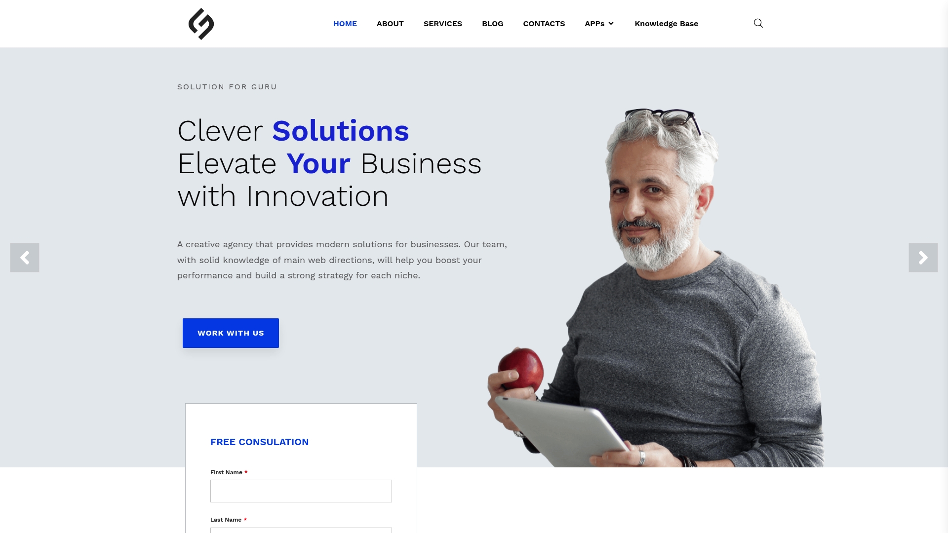
The practical difference is that a conversion problem rooted in slow page speed, a UX problem rooted in confusing navigation, and a messaging problem rooted in a weak value proposition all get diagnosed and fixed together, not in sequence by three different vendors. Solution4guru offers free consultations, tailored conversion audits, and case-study-backed recommendations drawn from real client results across e-commerce, SaaS, and professional services. If your site is generating traffic but not the revenue that traffic should produce, that gap is worth a conversation.
FAQ
What is a good website conversion rate?
The average e-commerce conversion rate is 2.5%–3%. Rates above 3% are considered strong, though benchmarks vary by industry, traffic source, and business model.
Why is my website conversion rate so low?
Low conversion rates usually trace back to one or more of four causes: slow page load speed, a weak or unclear value proposition, too much friction in the checkout or form process, or misplaced trust signals. Start by identifying where visitors drop off using analytics and heatmap data.
How do I increase the conversion value from each visitor?
Increase average order value through upsells, product bundles, and free shipping thresholds that incentivize larger purchases. Personalized product recommendations based on browsing history also raise the value of each converted visitor.
How does A/B testing help improve conversion rates?
A/B testing removes guesswork by comparing two versions of a page element against real visitor behavior. Running tests for at least two weeks with a single variable and a defined goal produces reliable data that guides decisions rather than assumptions.
How can Solution4guru help with conversion rate optimization?
Solution4guru provides conversion audits, UX design improvements, and technical web development as part of an integrated digital strategy. Free consultations are available to identify the specific gaps affecting your site’s performance.