
What Is the Role of Typography in Design?

Typography is the visual structure that determines whether content gets read, understood, trusted, and remembered. Every typeface choice, every line-height setting, and every spacing decision either helps a reader move through content or gets in their way. The role of typography in design goes far beyond picking an attractive font. It governs legibility, builds hierarchy so eyes know where to land first, carries brand voice and tone before a single word registers, and directly shapes whether an interface feels accessible or exclusionary.
Consider what typography does in practice:
- Readability and legibility — determines whether text can be scanned quickly or forces readers to squint and reread.
- Hierarchy and scanability — guides the eye through headlines, subheads, and body copy in the order that matters.
- Brand voice and tone — a typeface communicates personality (formal, playful, technical) before content is even processed.
- Accessibility and UX performance — contrast and sizing standards affect bounce rates, recall, and inclusivity.
Common web practice sets body text near 16 pixels and H1 headers around 48 pixels. This baseline prioritizes information and keeps pages scanable across devices.
Key Takeaways
Typography works when size, weight, contrast, and spacing are applied consistently across a documented type system rather than chosen ad hoc per page.
Table of Contents
- Definition of Typography and the Components Every Designer Should Know
- Why Typography Matters for Readability, Branding, and User Behavior
- How Do Designers Build Hierarchy and Pair Fonts?
- What Are the Best Typography Practices for Web and App Interfaces?
- What Typography Mistakes Do Designers Make Most Often?
- How Do You Build Typography Into a Design System?
- What Does Research Say About Typography’s Effect on UX?
- How Did Typography Evolve Into What We Use Today?
- A Practitioner’s Take on Making Typography Disappear
- Get Professional Typography and UX Support for Your Project
- Where to Learn More About Typography Principles
- Sources
- FAQ
Definition of Typography and the Components Every Designer Should Know
Typography is the art and technique of arranging type so written language becomes readable, legible, and expressive. That’s the working definition the Interaction Design Foundation uses, and it holds up whether you’re laying out a magazine spread or a mobile app.
Before going further, it helps to share vocabulary. Design students especially trip over the difference between a typeface (the design, like Helvetica) and a font (a specific weight and size of that design, like Helvetica Bold 14pt). A handful of other terms show up constantly in critique sessions and style guides:
- Family — the full set of weights and styles within one typeface.
- Weight — thickness of strokes, from thin to black.
- Glyph — an individual character or symbol within a font.
- Leading (line-height) — vertical space between lines of text, which controls reading rhythm.
- Tracking — uniform spacing applied across a block of letters.
- Kerning — spacing adjustments between two specific letter pairs, critical for micro-legibility.
- X-height — the height of lowercase letters like “x,” which affects perceived size and readability.
- Counters — the enclosed or partially enclosed spaces in letters like “o” or “e.”
- Display vs. text typefaces — display type is built for short, large-scale impact; text type is built for extended reading.
Each of these maps to a real decision. Tight kerning on a headline can make letters collide; loose leading in a paragraph can make lines feel disconnected from each other.
Why Typography Matters for Readability, Branding, and User Behavior
Typography performs several distinct jobs at once, and neglecting any one of them shows up fast in user testing.
- Legibility and readability. These aren’t the same thing: legibility is about individual letterforms being distinguishable, while readability is about how comfortably a full block of text reads. A geometric sans with ambiguous lowercase “l” and capital “I” hurts legibility even if the paragraph spacing is perfect.
- Visual hierarchy and scanability. A headline set three sizes larger than body copy tells the eye exactly where to start. Skip that scale and every element competes for attention, which is why inconsistent hierarchy is one of the most common critique notes design students receive.
- Brand recognition and tone. Typography often communicates personality faster than color or imagery. A rounded, friendly sans reads casual; a sharp serif reads authoritative. Consistent typographic systems are why you can recognize certain brands from a headline alone.
- Emotional and psychological effects. Type choices shape first impressions and how people process information before they consciously evaluate content, an effect documented in visual perception research.
- Accessibility and inclusivity. Low contrast, undersized text, and lines that run too long all raise cognitive load for readers with visual or cognitive differences, and for everyone else on a small screen.
- User-behavior impacts. Poor typography correlates with higher bounce rates and lower content recall, which turns a typography decision into a business metric.
All-caps headlines are a good example of where good intentions backfire. They read as shouting and slow comprehension because readers lose the varied letterform shapes they rely on for quick recognition.
How Do Designers Build Hierarchy and Pair Fonts?
Three levers create hierarchy: size, weight, and contrast. Used together and applied consistently, they let a reader tell instantly what’s a headline, what’s a caption, and what’s body copy. Applied inconsistently, hierarchy breaks down and nothing stands out because everything is competing.
- Size establishes the primary scale (headline, subhead, body, caption).
- Weight adds emphasis without introducing a new typeface.
- Contrast — pairing a bold display face with a lighter text face, or a serif with a sans, sharpens the distinction between hierarchy levels.
Font pairing has a few durable rules. Cap most projects at two or three typefaces total. Pair for contrast with harmony, meaning the fonts should look different enough to signal hierarchy but share enough character (similar x-height, comparable proportions) that they don’t fight. A classic strategy: a serif for headlines paired with a clean sans for body copy, or vice versa. On the web, always define fallback fonts so a slow connection or missing web font doesn’t collapse your layout into an unstyled default.
Spacing rules matter just as much as font choice. Tight tracking on small text hurts legibility; loose tracking on large display type can look intentional and elegant. Use a modular type scale, meaning each size relates to the next by a consistent ratio, rather than picking sizes arbitrarily. A deliberate type scale creates mathematical harmony that ad-hoc sizing never achieves. Variable fonts are worth adopting when a project needs many weights without the performance cost of loading separate font files for each one.

Pro Tip: If text feels cramped at small sizes, increase line-height before you increase font size. A tighter font with generous leading often reads better than a larger font squeezed into single-spaced lines.
Display type is the one place you can break these rules deliberately. A poster headline or hero banner can use extreme weight contrast or unconventional spacing for effect, as long as it’s not the typeface carrying body copy elsewhere.
What Are the Best Typography Practices for Web and App Interfaces?
Digital interfaces need numeric rules because they render across wildly different screens. Practical guidelines that hold up across most projects:
| Element | Recommended Range |
|---|---|
| Body text size | 16 pixel baseline |
| Line height (leading) | 1.4 to 1.6 |
| Line length | 45 to 75 characters per line |
| Headline size (H1 example) | Around 48px |
| Body text contrast ratio | 4.5 to 1 minimum |
Responsive typography shouldn’t just scale every element proportionally. Use a type scale with relative units so headlines and body text adjust independently, and test layouts at actual device widths rather than trusting a design mockup. What looks balanced at desktop width often breaks at 375 pixels.
Performance matters too. Web fonts carry a loading cost, and unmanaged font loading causes FOUT (flash of unstyled text) or FOIT (flash of invisible text) that hurts perceived speed. Subsetting fonts and serving WOFF2 formats keeps file sizes down. A pragmatic pattern many teams use: system fonts for body copy, one web font reserved for headlines, balancing brand personality against load time. Solution4guru’s guide to UX design best practices covers how these accessibility thresholds fit into a broader interface audit.
What Typography Mistakes Do Designers Make Most Often?
Most typography problems trace back to the same handful of habits, and they’re fixable in a single revision pass.
- Too many typefaces — pick two or three max and stick to them across the whole project.
- Poor kerning — check letter pairs in headlines specifically; body text kerning issues are usually less visible.
- Insufficient contrast — run text against WCAG’s 4.5:1 minimum before calling a design done.
- Wrong line-height — too tight crowds lines together; too loose disconnects them from their paragraph.
- Inconsistent hierarchy — audit that every heading level uses the same size and weight across the entire file.
Before handoff, run a quick contrast check, zoom the design to test small-screen legibility, and audit the type scale for stray sizes that crept in during revisions.
Pro Tip: Watch for “design-by-decorative-display,” where an eye-catching display face gets applied to paragraphs of body copy. It looks striking in a mockup and becomes unreadable the moment someone actually tries to read it.
How Do You Build Typography Into a Design System?
Typography sticks when it’s documented, not improvised project by project. A repeatable process looks like this:
- Choose base typefaces during the concept phase, before layouts are finalized.
- Build a type scale with a consistent ratio between sizes.
- Define style tokens for size, weight, and line-height so developers implement exactly what was designed.
- Document approved font pairings so future contributors don’t introduce a fourth typeface.
- Add accessibility checks (contrast, zoom testing) into your QA step, not as an afterthought.
For a design system specifically, keep a checklist: versioned type tokens, an approved list of web weights, defined fallback fonts, and performance budgets for font loading. Adobe recommends building this formal type system early and testing legibility across sizes using browser dev tools before anything ships to production.
Typographic voice should map to brand values just as directly as color palettes do. Document tone-of-voice decisions (formal versus casual, technical versus friendly) alongside the type choices that support them, so copywriters and designers stay aligned. Solution4guru’s archive of implementation notes is a useful reference when building out that documentation.
What Does Research Say About Typography’s Effect on UX?
The connection between typography and measurable UX outcomes isn’t speculative. Consistent, high-quality typography reduces cognitive load and improves content recall, while poor typography correlates with higher bounce rates and visible user frustration.
Typography functions as infrastructure, not decoration. When spacing, hierarchy, and contrast are managed well, users read content without noticing the type choices at all. Visible friction almost always points back to spacing or hierarchy problems rather than the specific font.
That insight from typography principles research reframes how designers should treat critique feedback. If a reviewer says a page “feels off” but can’t point to the font, look at line-height and spacing first.
Practical takeaways designers can apply immediately:
- Default to a 16px body size baseline and test up from there.
- Hold contrast to at least 4.5:1 for body text.
- Test legibility at actual sizes and real device widths, not just at 100% zoom in your design tool.
How Did Typography Evolve Into What We Use Today?
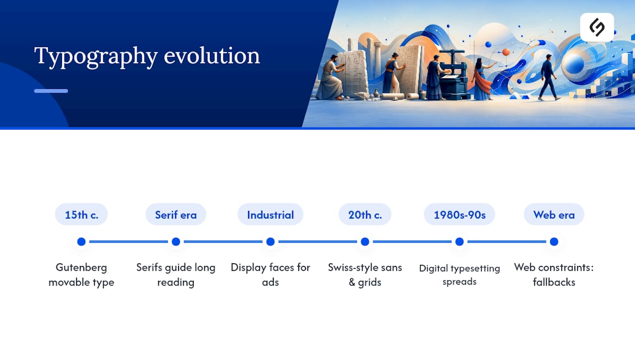
Typography’s role in design didn’t start with digital screens. It started with Johannes Gutenberg’s movable type press in the 15th century, which turned handwritten manuscripts into mass-produced, standardized text for the first time. That single invention established a principle designers still rely on: consistency at scale requires a repeatable system, not one-off craftsmanship.
The centuries that followed layered on refinements. Serif typefaces dominated printed books because their small strokes, called serifs, helped guide the eye along a line of dense text. The Industrial Revolution introduced bold display faces built for advertising and posters, where legibility at a distance mattered more than comfort during long reading. The 20th century brought sans-serif movements like Swiss Style typography, which stripped away ornamentation in favor of clean grids and geometric letterforms, an aesthetic you can still trace directly into modern app interfaces and corporate branding systems.
Digital typesetting in the 1980s and 1990s democratized type design, letting far more people set type without a print shop. The web era added its own constraint: type had to render reliably across unpredictable screens and connection speeds, which is why today’s typographic rules lean so heavily on flexible units, fallback fonts, and performance budgets. Every numeric guideline covered earlier in this piece, from line length to contrast ratios, is a direct descendant of problems typesetters have been solving since Gutenberg’s press.
A Practitioner’s Take on Making Typography Disappear
The best compliment a typography system gets is silence: nobody comments on it because nothing gets in the way of reading. In production work, that invisibility comes from type systems, not individual font choices. Solution For guru’s own work on design tool evolution reflects this same pattern across projects. This week, try building a three-step type scale (headline, subhead, body) for whatever project is in front of you, and see how much hierarchy clarity it adds immediately.
Get Professional Typography and UX Support for Your Project
Typography works best inside a broader UX strategy where accessibility, hierarchy, and brand voice are handled as one system rather than separate decisions made late in a project. Solution4guru’s team builds that kind of system for businesses that need typography, layout, and interface performance to work together from day one. If your team wants a structured audit of your current type system or full UX design support from concept through implementation, that’s exactly where a consultation with Solution4guru starts.
Where to Learn More About Typography Principles
- The Interaction Design Foundation — foundational definitions and terminology.
- LogRocket’s UX typography guide — UX outcomes tied to type decisions.
- Figma’s typography resource library — numeric web implementation rules.
- Adobe Creative Cloud’s typography guide — production and type-system workflow.
- RMCAD’s typography and branding analysis — brand recognition case examples.
- Font Kingdom on visual perception — psychological and emotional effects of type.
- Alhora — a tool for assembling type specimens across printed and digital outputs.
Sources
- Why typography still matters in UX design – LogRocket Blog
- Typography Principles for Designers: Font Pairing & Hierarchy
- How Typography Affects Visual Perception in Graphic Design – Font Kingdom
- Typography – Adobe Creative Cloud
- The Impact of Typography in Effective Graphic Design – RMCAD
FAQ
Typography controls readability, hierarchy, brand tone, and accessibility, making it the structural layer that determines whether content communicates effectively.
A typeface is the overall design (like Helvetica), while a font is a specific weight and size within that design (like Helvetica Bold 14pt).
Most web body text works best with a line-height of 1.4 to 1.6 and a line length between 45 and 75 characters per line.
Limit most projects to two or three typefaces total, using contrast in weight and style rather than adding a fourth typeface for variety.
Poor typography raises cognitive load and frustrates readers, which correlates with higher bounce rates and reduced content recall on web pages.
Recommended
- The Future Unveiled: The Evolution of Graphic Design Tools and Techniques
- UX Design Best Practices for Designers and Product Managers – Solution for Guru
- How to Improve Power Professionally Using Project Management Software Fast – Solution for Guru
- Understanding the Role of Data in Marketing Strategies – Solution for Guru