
Improve Website UX: A Playbook for Product and Design Teams

Three moves account for most measurable UX gains: cut page load time, fix mobile responsiveness, and simplify navigation and calls to action. Together they shorten task completion, lower bounce rates, and lift conversions faster than any redesign. The rest of this guide breaks each into concrete steps, then walks through a repeatable process for diagnosing, fixing, and validating what comes next.
TL;DR:
- Speed up your site by compressing images, aggressively caching content, and reducing main-thread work to improve Core Web Vitals and user retention.
- Improve mobile UX with responsive images, a fast critical rendering path, and skeleton screens to reduce perceived load times and layout shifts.
- Focus on a single primary call to action per page and streamline forms to boost conversions, using clear microcopy and inline validation.
- Use a structured, five-stage process of diagnosing, prioritizing, fixing, validating, and monitoring UX issues to ensure measurable improvements.
- Starting with a lightweight audit and testing real user sessions helps validate changes and prevents endless, ineffective redesigns.
Table of Contents
- How to Improve Website UX With High-Impact Tactics
- What Is the Best Process for Fixing UX Problems?
- Accessibility Quick Wins Every Team Can Ship This Quarter
- Mobile Speed and Core Web Vitals: What to Fix First
- Conversion-Focused UX: CTAs, Forms, and Microcopy That Reduce Friction
- Which Usability Testing Method Should You Use?
- How Solution4guru Applies This Playbook in Real Projects
- Personalization and Adaptive Experiences Without Overcomplicating Things
- Emotional Design: Why Delight Drives Retention, Not Just First Impressions
- Where To Start If You’re Rebuilding UX From Scratch
- Get Expert Help Implementing These UX Fixes
- Tools and Standards Worth Bookmarking
- Sources
- FAQ
How to Improve Website UX With High-Impact Tactics
Most UX failures trace back to a handful of recurring problems: slow pages, confusing menus, cluttered forms, and calls to action that compete for attention instead of guiding it. Fixing these doesn’t require a full redesign. It requires discipline about which changes to make first and how to implement them correctly.
Here’s the priority list Solution4guru uses when auditing client sites, ordered roughly by effort-to-impact ratio:
- Compress and modernize images. Convert JPEGs and PNGs to WebP or AVIF, and set compression targets that keep visual quality intact while cutting file size by half or more.
- Cache aggressively. Use browser caching and a content delivery network so returning visitors and repeat page loads feel instant.
- Reduce main-thread work. Defer non-critical JavaScript and split large bundles so the browser can render visible content before running background scripts.
- Design for thumbs first. Touch targets need at least 44 by 44 pixels of tappable space, and primary actions belong within easy reach of one hand.
- Serve responsive images. Use
srcsetandsizesattributes so mobile devices download a smaller image instead of scaling down a desktop-sized file. - Simplify mobile navigation. Collapse secondary links into a hamburger menu, but keep the two or three tasks users care about most visible without a tap.
- Use task-based labels in navigation. “Track My Order” outperforms “Account Services” because it names the action, not the department.
- Add search and breadcrumbs. Site search rescues users who arrive with a specific goal and no patience for browsing; breadcrumbs orient them once they’ve drilled down.
- Build visual hierarchy with typography and spacing. Larger, higher-contrast headings paired with generous white space guide the eye without extra design work.
- Commit to one primary CTA per page. Competing buttons split attention and measurably reduce click-through on the action that actually matters.
- Cut form fields to the essentials. Every field you remove increases completion rate; ask for what you need to complete the transaction, not what might be useful someday.
Accessibility deserves its own line item here too: visible focus states, descriptive alt text, and readable form labels aren’t extras. They’re baseline usability for a meaningful share of your visitors.
Pro Tip:
Before you touch the design, run your homepage through Lighthouse and note the Largest Contentful Paint score. A slow LCP often explains bounce problems that teams misdiagnose as a navigation or content issue.
Progressive disclosure helps here too. Instead of dumping every option on screen, show the essential path first and reveal advanced settings or filters only when a user asks for them. Guided empty states, the blank screens users hit before they’ve added data, deserve the same treatment: tell people what to do next instead of leaving them staring at nothing. Baymard’s UX research consistently finds that consistent navigation patterns and simplified checkout flows correlate directly with fewer abandoned sessions, which is exactly why the design-system point above isn’t cosmetic. Consistency reduces the cognitive tax every new screen imposes, and UXMag’s analysis of UI consistency ties that same repetition of patterns to measurably higher user trust.
What Is the Best Process for Fixing UX Problems?
Random redesigns waste budget. A repeatable five-stage cycle turns scattered feedback into prioritized, measurable work:
- Diagnose. Pull funnel data, drop-off points, and Core Web Vitals scores from your analytics platform, then pair them with qualitative signals from session recordings or a handful of moderated user interviews. Numbers tell you where users struggle; watching them struggle tells you why.
- Prioritize. Score each identified problem on reach (how many users hit it), severity (how badly it blocks the task), business impact, and the effort required to fix it. A high-severity issue affecting 2% of traffic often loses to a moderate issue affecting 40%.
- Fix. Match the diagnosis to the right fix type. Slow pages need performance engineering. Confusing menus need information architecture work. Vague copy needs a content pass. Broken multi-step flows sometimes need a genuine redesign, not a patch.
- Validate. Run an A/B test where traffic allows, or a moderated usability session with five to eight participants when it doesn’t. Either way, define your success metric before you launch the fix, not after.
- Monitor. Track task success rate, completion rate, and Core Web Vitals on a monthly cadence so regressions get caught before they compound.
This loop matters because it prevents UX work from becoming an endless backlog of disconnected tweaks with no way to prove any of them worked, a pattern Eleken’s optimization framework was built specifically to interrupt. It also gives you the language to defend the budget: Forrester’s framework for justifying UX investment ties specific UX fixes to specific business outcomes, which is a much stronger pitch to a finance team than “the design felt dated.”
Statistic Callout:
Teams that pair analytics with direct user observation catch problems that either method misses alone. A funnel report shows where users leave; only watching them attempt the task reveals whether the exit was confusion, mistrust, or simple disinterest.
Accessibility Quick Wins Every Team Can Ship This Quarter
Accessibility isn’t a separate initiative bolted onto UX work. It’s usability for a wider set of conditions, temporary, situational, and permanent. The W3C’s WCAG 2.1 guidelines remain the reference standard, organized around four principles: content must be perceivable, operable, understandable, and robust.
You don’t need a full audit to start. Run these checks this week:
- Test color contrast ratios against WCAG’s minimum thresholds using a free contrast checker.
- Tab through your entire site using only the keyboard and confirm every interactive element gets a visible focus outline.
- Run an automated scan with axe or the Lighthouse accessibility report to catch missing alt text and unlabeled form fields fast.
- Spot-check your top three pages with a screen reader like VoiceOver or NVDA.
- Write link text that describes the destination (“Download the pricing sheet”) instead of “click here.”
These fixes overlap heavily with SEO and conversion work, since search engines and paying customers both reward clear semantic structure and readable content.
Mobile Speed and Core Web Vitals: What to Fix First
More than half of global website traffic now comes from mobile devices, which means a slow or janky mobile experience isn’t a secondary concern. It’s the primary one for most sites.
Start with the critical rendering path: identify what content appears above the fold and make sure nothing blocks it from rendering, especially render-blocking CSS and synchronous scripts. Defer everything else.
- Serve responsive images with
srcsetand lazy-load anything below the fold. - Reserve space for images and ads before they load so content doesn’t jump around as the page renders, which is what causes most Cumulative Layout Shift penalties.
- Never insert new content above what a user is currently reading.
- Use skeleton screens instead of blank white space while data loads, since a visible placeholder feels faster even when load time is identical.
Pro Tip: A progress indicator on anything that takes more than a second, whether it’s a page load or a multi-step form submission, reduces perceived wait time even when actual load time doesn’t change.
Conversion-Focused UX: CTAs, Forms, and Microcopy That Reduce Friction
Every page should have exactly one dominant call to action. When two buttons compete for the same click, both underperform compared to a single, clear next step. Place that CTA where the user’s attention naturally lands after they’ve absorbed enough information to act, not before.
Form friction kills more conversions than weak copy ever will:
- Ask only for fields you genuinely need at this step; save the rest for after signup.
- Validate inline, as the user types, instead of dumping every error after they hit submit.
- Write specific error messages (“Enter a valid email address”) instead of generic ones (“Invalid input”).
- Enable autofill and match your field labels to what browsers expect.
Microcopy does real work here too. A line near a payment field reassuring users about data security, or a note that returns are free, lowers the psychological cost of committing. Baymard’s checkout research has repeatedly found that unclear return policies and hidden costs are among the top reasons shoppers abandon carts at the final step.
Statistic Callout: When testing CTA and form changes, test one variable at a time and let each test run long enough to reach a real sample size. A button color change and a copy change tested together tells you nothing about which one moved the number.
Which Usability Testing Method Should You Use?
Match the test to the question you’re actually asking:
- Moderated testing (five to eight participants) works best for early-stage flows where you need to hear the “why” behind confusion, not just see it happen.
- Unmoderated testing scales cheaper for validating a specific flow once you already know roughly what to look for.
- Tree testing validates whether your navigation labels and hierarchy make sense before you build a single screen.
- First-click testing tells you whether users know where to start on a new page or feature, which strongly predicts whether they’ll complete the full task.
Whichever method you choose, measure task success rate, time on task, and funnel drop-off, then feed the results straight back into your prioritization step rather than treating the test as a one-off exercise.
How Solution For guru Applies This Playbook in Real Projects
Solution4guru runs client engagements through the same diagnose, prioritize, fix, validate, monitor cycle outlined above, pairing analytics review with direct usability sessions before recommending any redesign work. That discipline shows up in the agency’s UX design best practices resource, which Vadim developed alongside client engagements covering navigation restructuring, checkout simplification, and accessibility remediation.
Teams without in-house UX researchers or performance engineers often stall here, not from lack of ideas but from lack of hours. An external partner brings the audit tooling, the testing cadence, and the engineering bandwidth to move from diagnosis to shipped fix without pulling product managers off their existing roadmap.
Personalization and Adaptive Experiences Without Overcomplicating Things
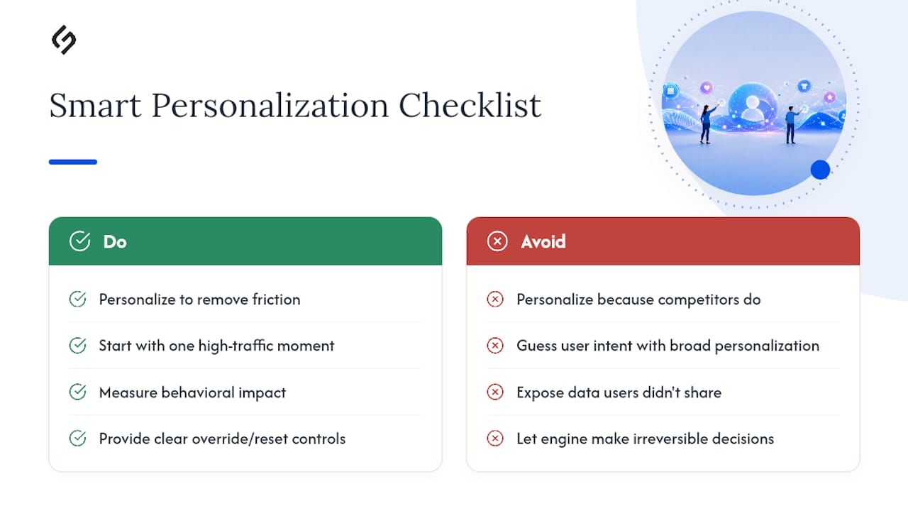
Personalization earns its place in a UX strategy only when it removes friction, not when it’s added because competitors have it. The most reliable version is behavioral: showing a returning visitor their recently viewed products, or surfacing the pricing tier closest to what a similar visitor segment converts on.
Adaptive experiences that respond to device, location, or session history can meaningfully shorten a task, a returning B2B buyer who lands straight on their saved cart skips several steps entirely. But personalization introduces real risk if it’s built on shaky logic: showing the wrong recommendation, or worse, referencing data a visitor never knowingly shared, damages trust faster than a slow page ever would.
Start narrow. Personalize one high-traffic moment, like a homepage hero or a post-purchase recommendation, and measure whether it actually changes behavior before expanding the approach. Adaptive interfaces that adjust layout density or navigation depth based on user role (a common pattern in B2B SaaS dashboards) tend to outperform broad content personalization, because the adaptation solves a real usability problem rather than guessing at intent.
Any AI-driven personalization feature needs the same guardrails as a manual one: show users what’s happening, give them an easy way to override or reset a recommendation, and never let a personalization engine make a decision that should stay in the user’s hands, like removing a product from view entirely instead of just reordering it.
Emotional Design: Why Delight Drives Retention, Not Just First Impressions
Users don’t just judge a site on whether they completed a task. They judge it on how the task felt. A checkout that works but feels sterile and untrustworthy loses repeat customers just as fast as one that’s slow. Emotional design closes that gap through small, deliberate signals: warm confirmation messages, a loading animation with personality instead of a bare spinner, or copy that acknowledges effort (“Almost there” instead of silence).

Microinteractions do a disproportionate amount of this work. A button that visibly responds to a click, a subtle animation confirming an item was added to a cart, a color shift on a successful form submission, each one reassures the user that the system heard them. Skip these signals and even a fast, functional site feels cold and unresponsive, because users have no confirmation their action registered.
The goal isn’t decoration for its own sake. It’s reducing anxiety at the exact moments users feel most uncertain: submitting payment information, deleting something, or waiting on a slow process. A well-timed message that explains why a page is taking a few seconds does more for user sentiment than shaving another 200 milliseconds off load time. Engagement, in practice, is built from dozens of these small moments compounding across a session, not from one dramatic feature.
Where To Start If You’re Rebuilding UX From Scratch
Spend the first 30 days on a lightweight audit: pull your analytics funnel data and watch three real user sessions before changing anything. In the next 60 days, ship your top three fixes, validate each one, and start monthly monitoring. The most common mistake is skipping validation and moving straight to the next redesign.
Get Expert Help Implementing These UX Fixes
Reading a UX playbook and executing it under deadline pressure are two different problems, and most in-house teams run out of engineering hours before they run out of ideas. Solution4guru works with B2B teams and growing enterprises on exactly the gaps this article covers: UX audits that pair analytics with real user sessions, performance engineering to fix Core Web Vitals scores, accessibility remediation against WCAG standards, and design systems that keep new features consistent as your product grows.
Most Solution4guru engagements start with a business that already has traffic and conversion data but lacks the internal bandwidth to run a full diagnose-to-validate cycle without pulling product staff off the roadmap. If that describes your team, a free UX consultation is the fastest way to get a prioritized fix list instead of another backlog item labeled “improve UX someday.”
Tools and Standards Worth Bookmarking
For ongoing audits, lean on WCAG 2.1 and the W3C’s accessible design guidance as your accessibility baseline. Use Lighthouse and PageSpeed Insights for performance scoring, axe for automated accessibility scans, and a tree-testing platform to validate navigation before you build it. For deeper UX principles, Baymard’s research library remains one of the most thorough freely available resources.
Sources
- Statista — share of website traffic coming from mobile devices
- Baymard — The best practices and key principles of UX design
- Forrester — The Six Steps for Justifying Better UX
FAQ
Start by diagnosing real problems with analytics and a few user sessions, then fix the highest-impact issues first, usually speed, mobile responsiveness, and navigation clarity, before validating each change with a test.
Definitions vary across sources, but a common version centers on clarity, consistency, credibility, and consideration for the user’s context; consistency in particular is well documented as a driver of trust and reduced cognitive load.
This term is more common in marketing (referring to repeated brand exposures) than in formal UX research, and no single canonical UX definition of it exists; teams researching navigation depth should look instead at established information architecture guidance like task-based labeling and reduced top-level menu items.
Focus on the highest-leverage fixes first: compress images and reduce load time, make touch targets and navigation mobile-friendly, cut form fields to the essentials, and run a usability test before and after any major change to confirm it actually helped.
Yes. Solution For guru runs UX audits, performance engineering, and accessibility remediation through the diagnose, prioritize, fix, validate, monitor cycle described above, and offers a free consultation to scope the highest-impact fixes for your site.