
User Experience vs User Interface: What Sets UX and UI Apart

User experience (UX) is the whole of a person’s interaction with a product, service, and company. User interface (UI) is the part of that product a person actually sees and touches: screens, buttons, type, color, and navigation. UI is one component of UX. A business can have a polished interface and still deliver a frustrating experience, and the reverse is rare for anything digital.
For owners and marketing or IT leads commissioning a website, app, or platform, the distinction decides what to budget, whom to hire, and in what order the work happens. This guide defines both terms, shows where they overlap, explains how each is measured, and sets out how to sequence the work.
TL;DR
- UX is the whole journey; UI is the visible layer. UX covers research, workflows, usability, and satisfaction. UI covers typography, color, layout, and interactive components.
- UI cannot rescue a flawed system. Flawless button placement does not compensate for incomplete data or broken business logic behind it.
- Both are measurable. Effectiveness, efficiency, and satisfaction give teams objective targets for UX and usability.
- Sequence matters. UX research should inform UI design before visual assets are produced, which avoids costly redesigns.
- Accessibility belongs to both disciplines. WCAG 2.2 sets the technical benchmark for interface components.
Table of Contents
- What user experience means
- What user interface means
- UX vs UI at a glance
- Why a good UI does not guarantee a good UX
- How each discipline is measured
- Accessibility: a shared responsibility
- Why sequence matters
- Perspective: where we see projects go wrong
- Choosing the right specialist for the work
- Where Solution4Guru fits
- Common mistakes to avoid
- FAQ
- Sources
What user experience means
The definition most often cited traces back to Don Norman and Jakob Nielsen. In their definition of user experience, the term encompasses all aspects of the end user’s interaction with the company, its services, and its products. That scope is deliberately wide. It includes how a customer discovers the brand, how an account is created, what happens when something goes wrong, and how support responds.
The Nielsen Norman Group also separates two uses of the term. User experience can describe the interaction itself, or it can describe a design discipline. The first is what every customer already has, whether designed or not. The second is the practice of shaping it deliberately.
In practice, UX work typically includes:
- User research: interviews, surveys, and analysis of how people currently complete a task.
- Information architecture: how content and functions are grouped and labeled.
- Workflows and user flows: the sequence of steps from intent to outcome.
- Wireframes and prototypes that are tested before they are built.
- Usability testing and iteration after launch.
It is also not limited to screens. Coursera notes that UX can apply to almost any product or service, while the term UI design applies only to digital products.
What user interface means
The interface is the point of contact. Shopify’s explanation describes UI as the specialized subset concerned with the visual and interactive components through which users operate a digital product, such as buttons, typography, and navigation. Figma’s overview puts it as the interactivity, look, and feel of a screen or web page.
UI work typically covers:
- Visual design: color palettes, typography, iconography, spacing, imagery.
- Component design: buttons, forms, menus, modals, tables, and their states (default, hover, error, disabled).
- Layout and responsive behavior across desktop, tablet, and mobile.
- Design systems: documented, reusable components that keep a product consistent as it grows.
- Interaction details such as animations, transitions, and feedback messages.
A short way to hold the two ideas: UI is how the product looks and behaves on screen; UX is how well the whole thing works for the person and how it feels to use across the journey.
UX vs UI at a glance
| Dimension | User experience (UX) | User interface (UI) |
|---|---|---|
| Scope | Entire relationship with the product, service, and company | The screens and controls a person operates |
| Core question | Does this solve the user’s problem, and easily? | Is this clear, consistent, and visually coherent? |
| Typical activities | Research, journey mapping, information architecture, prototyping, testing | Visual design, components, layout, design systems, interaction details |
| Applies to | Digital and non-digital products and services | Digital products only |
| Typical deliverables | Personas, flows, wireframes, test findings | Style guides, high-fidelity mockups, component libraries |
| Success signals | Task completion, time on task, satisfaction | Visual consistency, legibility, accessible components |
Why a good UI does not guarantee a good UX
The Nielsen Norman Group’s guidance points to a common error: confusing UX with usability or with UI. Usability is a quality attribute of the interface. UX is broader and includes branding, service design, and long-term relationships.
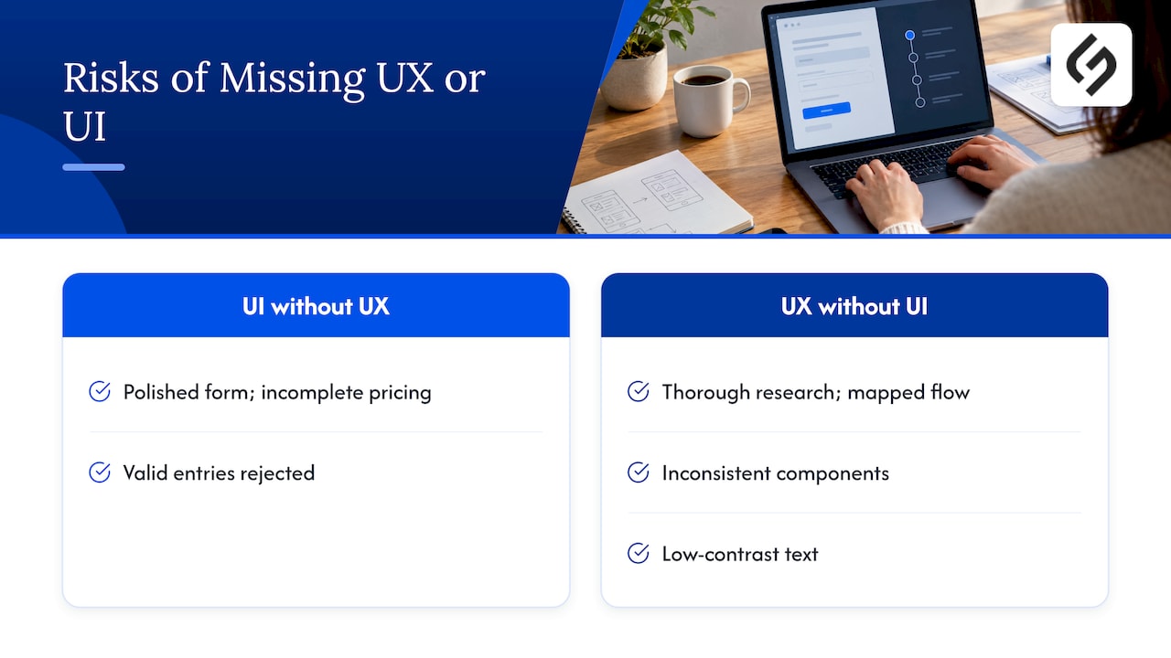
A concrete example follows from the original definition. Consider a quote request form with perfect alignment, clear labels, and on-brand colors. If the pricing data behind it is incomplete, or the business rules reject valid entries, the visitor still has a poor experience. The definition of user experience frames this as the outcome of the entire system, not only the visual layer.
The opposite failure is as common. A team that researches thoroughly and maps an excellent flow, then ships it with inconsistent components and low-contrast text, loses much of the benefit. Practitioners quoted in Figma’s resource observe that startups skipping dedicated UI design tend to struggle with brand consistency and accessibility, while those skipping UX research risk building something users do not need.
How each discipline is measured
UX is sometimes dismissed as subjective. Standards bodies treat it otherwise. Guidance from NIST describes usability through three attributes: effectiveness, efficiency, and satisfaction. Effectiveness can be tracked as percent task completion and error frequency. Efficiency is measured as time on task. Satisfaction is the user’s own assessment.
The NIST usability guide also shows how to set targets before design starts. One example objective is a task completed in under 20 seconds by 90% of first-time users. That is a health records context, but the logic transfers to a checkout, a lead form, or a customer portal.
A workable measurement plan for a business website might include:
- Effectiveness: percentage of test participants who complete a primary task, such as requesting a demo or finishing checkout.
- Efficiency: median time to complete that task, and the number of wrong turns or errors.
- Satisfaction: a post-task rating or short survey.
- Interface quality: a review of component consistency and accessibility against a written checklist.
Targets set early give stakeholders a shared definition of “ready to launch” and replace opinion with evidence.
Accessibility: a shared responsibility
Accessibility sits where UX and UI meet. UX decides whether the flow can be completed by people using a keyboard, screen reader, or voice control. UI decides whether contrast, focus states, target sizes, and labels make that possible.
The benchmark most teams reference is WCAG 2.2. It is organized around four principles: content must be perceivable, operable, understandable, and robust. Conformance is graded at levels A, AA, and AAA. Many organizations target AA, but legal and contractual requirements vary by country, sector, and customer, so a compliance question should go to qualified counsel and not be settled by a design team alone.
For a site that already exists, accessibility is easiest to address as part of a structured redesign. Our website redesign checklist walks through an audit-driven sequence that treats SEO and WCAG 2.2 together.
Why sequence matters
The ISO 9241-210 standard on human-centered design for interactive systems treats the approach as a lifecycle process, not a final phase. Usability and UX belong in planning and management from the initial concept, not as add-ons.
The NIST guide adds the practical consequence: when UX researchers inform UI designers before visual assets are created, teams avoid costly redesigns when an interface fails to meet user goals or accessibility standards found in early testing.
A sensible order of work:
- Discovery. Business goals, audience, and current analytics. Interviews with customers and internal teams.
- UX definition. Journeys, information architecture, and success metrics.
- Low-fidelity prototypes. Wireframes tested with real users before any visual polish.
- UI design. Visual language, components, and a design system, checked against accessibility criteria.
- Build and integrate. Development, CRM and data connections, analytics instrumentation.
- Measure and refine. Compare results with the targets set in step 2 and iterate.
This lifecycle view also fits broader modernization work. Our five-phase digital transformation model shows where design decisions sit relative to process, platform, and measurement choices.
Perspective: where we see projects go wrong
Most of the confusion we encounter is not about vocabulary. It is about ownership. A company asks for a “UI refresh” because the site looks dated, when the real problem is that visitors cannot find pricing logic, or the form feeds a CRM that sales never checks. The new visual layer launches, and the metrics barely move.
Our approach is strategy first. We start from the business model and the workflow the interface has to support, then design the experience and the interface around it. That is why our projects are tailored to each client’s workflows and goals and not drawn from templates. It is also why we treat setup as the beginning: ongoing optimization after launch is where UX gains are confirmed.
Three practical rules we apply:
- Decide the success metrics before the first mockup.
- Treat the systems behind the screen (data, integrations, automations) as part of the experience.
- Keep UX and UI in one conversation, not two handoffs.
— Vadim
Choosing the right specialist for the work
Job titles blur in this field. A UX designer, a UX researcher, a UI designer, and a product designer may overlap. Coursera’s comparison of the two roles is a useful reference for how the responsibilities are usually split. For a business buyer, the more helpful questions are about outcomes:
- Who owns research and testing, and how are findings turned into design decisions?
- Who maintains the design system after launch?
- How are accessibility checks built into the process?
- Who connects the front end to the CRM, analytics, and automation behind it?
- Which metrics define success, and who reviews them after launch?
Small teams often cannot hire every role in house. An agency that covers research, design, development, and integration under one plan removes the handoff gaps that cause rework.
Where Solution4Guru fits
For businesses that need UX, UI, and the technology behind them aligned, we offer UI/UX design alongside custom web development, e-commerce development, SEO and digital marketing, and CRM and SaaS integrations. Engagements are project-based or retainer-based, and begin with a free consultation. See the full list on our services overview, or, if HubSpot is part of your stack, the HubSpot implementation and integration services.
Common mistakes to avoid
- Using the terms interchangeably in briefs. A request for “UX/UI” without scope leads to proposals that cover only screen design.
- Designing screens before understanding tasks. Visual polish applied to an unvalidated flow often has to be redone.
- Treating accessibility as a final audit. Contrast, focus order, and labeling are far cheaper to fix in design than after development.
- Skipping measurement. Without baseline numbers for task completion and time on task, improvement cannot be shown.
- Ignoring the back end. Slow pages, incomplete data, and disconnected systems degrade the experience regardless of how the interface looks.
FAQ
What is the difference between user experience and user interface?
User experience is the overall result of using a product or service, including research-driven structure, usability, and satisfaction. User interface is the set of visual and interactive elements, such as buttons, type, and layout, that a person operates. UI is one part of the broader UX.
Can a product have good UI and bad UX?
Yes. A screen can be attractive and consistent while the underlying workflow is confusing or the data behind it is wrong. The experience is judged on the whole system, so visual quality alone does not make a product easy or useful.
Which should a business invest in first, UX or UI?
UX comes first in sequence, because research and flow decisions shape what the interface must contain. UI then gives those decisions a clear, accessible form. For most projects both are needed, and budgeting them together avoids rework.
Is UX only about websites and apps?
No. UX applies to any product or service, including physical products and support processes. UI design, by contrast, refers specifically to digital products.
How do you know whether a UX improvement worked?
Compare results with targets set before the redesign. Effectiveness (task completion and errors), efficiency (time on task), and satisfaction are the standard attributes, as described in NIST guidance.
Sources
- The Definition of User Experience (UX), Nielsen Norman Group
- What Is User Experience (and What Is It Not)?, Nielsen Norman Group
- UI vs UX: What’s the Difference between UI & UX Design?, Figma
- UI vs. UX: Understanding the Difference, Shopify
- UI vs. UX Design: What’s the Difference?, Coursera
- NIST: Guide to the Processes Approach for Improving the Usability of Electronic Health Records
- NIST: usability publication on effectiveness, efficiency, and satisfaction
- Web Content Accessibility Guidelines (WCAG) 2.2, W3C
- ISO 9241-210:2019, Human-centred design for interactive systems