Smartsheet Dashboards: How Do You Build Reports That Leaders Actually Use?
Most organizations do not lack reports. They lack reports that leaders open, trust, and act on. A dashboard that packs forty widgets onto one screen may impress its builder, yet it leaves an executive scrolling in search of a single answer: are we on track? Smartsheet gives teams the tools to build far better. This guide shows how to design Smartsheet dashboards around leadership decisions, choose the right widgets, prepare clean source data, manage permissions, and keep every report alive after launch. Follow these steps, and your dashboards will earn a place in the Monday meeting instead of the digital graveyard.
Table of contents
Quick Summary
- Core idea: Leaders use dashboards that answer their questions quickly, so design for decisions rather than data display.
- Start with people: Interview your audience before you drag a single widget onto the canvas.
- Prepare the data first: Clean sheets, consistent columns, and sheet summary fields make dashboards reliable.
- Choose widgets carefully: Metric, chart, and report widgets each fit different questions.
- Keep it focused: One dashboard should serve one audience and one purpose.
- Control access: Dashboards offer Admin and Viewer permissions only, so plan sharing before launch.
- Maintain it: Assign an owner, review quarterly, and retire dashboards that nobody opens.
- Platform link: Smartsheet Project Management supplies the sheets, reports, and automation that feed every dashboard.
What Is Smartsheet Project Management and How Does It Relate to Dashboards?

Smartsheet Project Management is a work management platform that combines spreadsheet-style sheets with Gantt charts, cards, calendars, forms, automation, and reporting. Teams plan projects, assign tasks, track budgets, and collaborate in one workspace. Dashboards sit on top of that foundation.
Where do dashboards fit inside the platform?
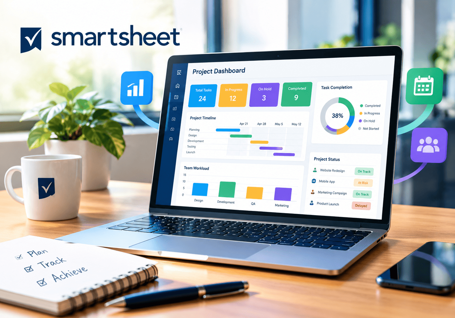
Smartsheet’s own help center describes dashboards as the visual layer of your work in Smartsheet. They summarize project status and key performance indicators (KPIs) for stakeholders in one place. They also organize frequently used resources, such as documents, links, and collections of sheets or reports.
Why does this relationship matter for report quality?
A dashboard shows only what the underlying work data contains. Consequently, the quality of your dashboard depends on the discipline of the teams who update sheets in Smartsheet Project Management. Widgets display live data from sheets and reports, so a status change on Tuesday appears on the executive view Tuesday afternoon. That real-time link removes the slide-deck ritual of copying numbers into presentations every week, and it explains why leaders can trust a well-built dashboard.
Why Do Leaders Ignore Most Dashboards?
Before you build, understand why so many dashboards fail. Most failures share the same handful of causes.
Which mistakes drive leaders away?
- Too much information. A crowded page hides the one number that matters.
- No clear question. The dashboard shows data but answers nothing.
- Stale or doubtful data. One wrong figure destroys trust for months.
- Wrong audience. Builders design for themselves, not for executives.
- Confusing labels. Internal jargon forces leaders to ask for translations.
- Hard access. Leaders will not chase links or request permissions.
What do leaders actually want?
Executives usually ask four questions: Where do we stand? What changed? What needs my decision? Where might we fail? A useful dashboard answers those questions within seconds. Therefore, every widget must earn its spot by serving at least one of them. If a widget does not, remove it.
How Do You Define the Purpose and Audience of a Dashboard?
Great dashboards begin with conversations, not software. Spend time with the people who will use the result.
What should you ask your stakeholders?
| Question | Why it matters |
|---|---|
| Which decisions do you make each week? | Ties widgets to real actions |
| Which three numbers do you check first? | Identifies your headline metrics |
| How often do you review status? | Sets the refresh rhythm |
| Where do you read reports (desktop, phone, meeting screen)? | Guides layout and size |
| What would make you distrust a report? | Reveals data quality requirements |
| Who else needs to see this? | Shapes sharing and permissions |
How do you turn answers into a dashboard brief?
Write a one-paragraph brief that names the audience, purpose, key questions, and update frequency. For example: “This dashboard helps the executive team see portfolio health each Monday, spot at-risk projects, and approve resource shifts.” Share the brief with stakeholders and confirm it. That short step prevents endless rework later.
What Data Preparation Makes Smartsheet Dashboards Reliable?
Dashboards magnify data problems. A messy sheet produces a messy chart, and leaders notice immediately. Prepare your sources before you build.
Which sheet habits matter most?
Start with consistent column types and clear naming. Use dropdown lists for status, priority, and health fields, so people enter the same values every time. Additionally, apply date columns rather than text for deadlines, because charts and reports rely on typed data. Finally, lock or protect the columns that hold critical values.
How can summary fields help?
Smartsheet‘s sheet summary lets you store key figures, such as total budget, percent complete, or count of red projects, in one place. Metric widgets can read those values directly. As a result, you avoid complicated formulas in the dashboard and keep the logic in the sheet, where owners can audit it.
What should you clean before launch?
- Remove duplicate rows and abandoned test tasks.
- Standardize status labels across teams.
- Fill required fields, or make them mandatory through forms.
- Assign every task an owner and a due date.
- Set up automation reminders that prompt people to update their work.
Because leaders trust numbers only when teams maintain them, this preparation work often decides success more than any design choice.
Which Smartsheet Dashboard Widgets Should You Use?
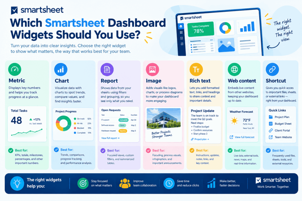
Widgets act as the building blocks of every dashboard. Smartsheet’s documentation lists several types, including metric, chart, report, image, web content, and rich text widgets. Choosing the right one for each question keeps your dashboard clear.
What does each widget do best?
| Widget | Best use | Leadership example |
|---|---|---|
| Metric | Display a key figure from one or more cells | Percent of projects on track |
| Chart | Show trends or comparisons from a sheet or report | Budget spent by month |
| Report | Present a filtered list of rows from many sheets | Overdue milestones across the portfolio |
| Image | Add logos, diagrams, or visual context | Program roadmap graphic |
| Rich text | Add titles, notes, and instructions | “Updated every Monday at 8 a.m.” |
| Web content | Embed external content such as forms or videos | Intake form link for new requests |
| Shortcut | Link to sheets, reports, or other dashboards | Quick access to the project plan |
How do you match widgets to questions?
Use a metric widget for “how many” or “what percent.” Use a chart for “how has it changed.” Also, use a report widget for “which ones need attention.” Meanwhile, reserve rich text for context, such as definitions and update times. Smartsheet also offers an AI chart widget that helps build charts, though you should always check the result against your source data.
Which limits should you know?
Chart widgets typically draw from a single sheet or report, and permission rules apply to the source data. Confirm current capabilities and plan availability on Smartsheet’s help center, since features differ by plan and change over time.
How Do You Design a Dashboard Layout That Leaders Read Quickly?
Layout decides whether a leader grasps the message in five seconds or gives up. Smartsheet dashboards use a grid, so you can arrange widgets in rows and columns. Plan that grid before you fill it.
What layout principles work best?
- Put the headline first. Place the most important metrics in the top row.
- Follow the reading path. Arrange content left to right and top to bottom.
- Group related items. Keep budget, schedule, and risk widgets together.
- Limit the count. Aim for a small number of widgets per screen.
- Leave white space. Empty areas guide the eye and reduce fatigue.
- Repeat patterns. Use the same layout across similar dashboards.
How should you handle color and labels?
Choose a restrained palette. Reserve red, amber, and green for status, so leaders read them instantly. Furthermore, write titles as plain statements, such as “Projects at risk” instead of “RAG_Count_Q3.” Add a short rich text note that states the data source and last review date.
Should you test the layout first?
Yes. Smartsheet’s own best-practice guidance suggests using placeholder text widgets to test sizing and organization before you connect data. Then connect the data and refine the formatting. Ask one leader to review the draft and explain what they see. If they misread it, adjust the design.
Which Metrics Belong on a Leadership Dashboard?

Metrics turn activity into insight. However, too many metrics dilute attention, so choose a compact set that reflects real outcomes.
What core metrics do most project leaders need?
| Category | Example metrics |
|---|---|
| Schedule | Percent complete, milestones due, days late |
| Budget | Planned vs. actual spend, forecast at completion |
| Scope and delivery | Deliverables completed, change requests open |
| Risk and issues | High risks open, issues past due |
| Resources | Utilization, capacity vs. demand |
| Quality or value | Defects, customer satisfaction, benefits realized |
How do you choose leading and lagging indicators?
Lagging indicators, such as completed projects, show results after the fact. Leading indicators, such as overdue tasks or unresolved risks, warn leaders early. A strong dashboard mixes both. Consequently, leaders can act before a problem becomes a crisis.
How do you define each metric clearly?
Write a one-line definition for every figure, and store it near the widget or in a linked reference sheet. For instance, define “on track” as “no milestone more than five days late and spend within ten percent of plan.” Clear definitions end arguments about what the numbers mean.
How Do You Build a Dashboard in Smartsheet Step by Step?
With planning and data ready, the build itself moves quickly. Smartsheet’s help center explains that you create a dashboard from the Create menu, start with a blank canvas, and add widgets one by one.
What steps should you follow?
- Create the dashboard. Choose the dashboard option and give it a clear name.
- Add a title widget. State the audience and purpose.
- Build headline metrics. Connect metric widgets to sheet summary fields.
- Add charts. Connect them to sheets or reports that hold the right data.
- Add a report widget. Show exceptions, such as overdue items.
- Insert context. Add rich text notes, links, and shortcuts.
- Arrange and resize. Refine the layout on the grid.
- Test with real users. Open it on desktop and mobile.
- Share and publish. Grant access using the right permission level.
Who can build and edit dashboards?
Smartsheet‘s help articles list dashboards among features on Pro, Business, and Enterprise plans, and they state that owners and admins manage the layout. Verify your plan and permissions before you promise features to stakeholders.
How can Smartsheet Project Management support the build?
Because Smartsheet Project Management keeps plans, forms, reports, and automation in one environment, you can design the whole flow from data entry to executive view. Forms feed sheets, automations remind owners, reports filter rows, and dashboards present the result.
How Do Reports and Sheets Work Together in Dashboards?
Reports act as the bridge between messy project data and clean executive views. Understanding that bridge helps you build cleaner dashboards.
Why use reports as a dashboard source?
A report pulls rows from many sheets based on filters, such as “status is not complete and due date is before today.” You can then display that report inside a dashboard widget. This approach shows exceptions without exposing every project sheet. According to Smartsheet’s documentation, people shared to a dashboard often do not need access to the underlying sheets to see report content, though you should confirm the exact behavior for each widget type.
How do metric and chart widgets differ?
Smartsheet’s documentation notes that metric and chart widgets require at least editor-level rights on the source sheet when you build them. Third-party guides also warn that data from sheets can appear on a dashboard regardless of the viewer’s rights to the sheet. Therefore, review what each widget exposes before you share broadly.
What should you avoid?
- Do not point widgets at sheets that contain sensitive comments or personal data.
- Do not build charts on columns with mixed data types.
- Do not hide problems by filtering out red projects.
- Do not create separate report copies when one shared report will do.
How Should You Share Dashboards and Manage Permissions?
A dashboard that leaders cannot open has no value. Nevertheless, careless sharing exposes sensitive information. Balance access and control.
Which sharing options does Smartsheet offer?
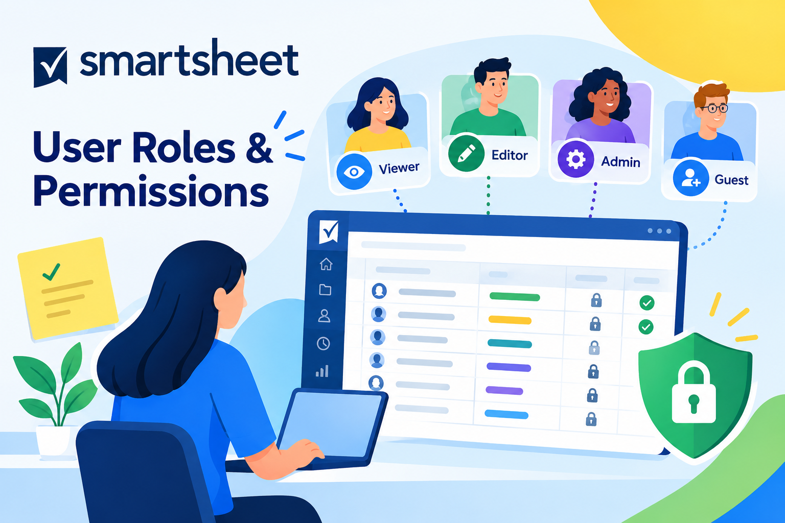
Smartsheet’s help center lists three ways to give people online access: place the dashboard in a workspace, share it directly, or publish it. Dashboards support only Admin and Viewer permission levels. People shared through a workspace with editor or commenter rights can view the dashboard but cannot edit it.
Which option suits which audience?
| Method | Best for | Watch out for |
|---|---|---|
| Workspace | Project teams working together | Workspace members see everything shared there |
| Direct share | Named executives and stakeholders | Manage the list as roles change |
| Publish link | Broad or external audiences | Anyone with the link may view it |
What security habits protect you?
Review who holds Admin rights and keep that group small. Additionally, check each source sheet and report for confidential content before you publish. Then audit access every quarter, and remove people who changed roles. When in doubt, involve your security or compliance team.
How Do You Make Dashboards Work for Mobile and Meeting Use?

Leaders check status in elevators, airports, and boardrooms. Design for those moments.
What helps on mobile?
Smartsheet notes that dashboards are easy to view on the desktop and in the Smartsheet mobile app. Keep the top of the dashboard simple, because phones show a narrow slice at once. Put the headline metrics first, and avoid tiny text in embedded content.
What helps in meetings?
Large metric widgets and clear charts read well on a shared screen. Meanwhile, a dedicated “meeting view” dashboard can hide detail and highlight decisions. Use the same view every week, so participants learn where to look.
How can you build a routine around the dashboard?
- Open the dashboard at the start of the weekly leadership meeting.
- Assign each red or amber item to a named owner.
- Record decisions in a linked sheet.
- Update the dashboard before, not after, the meeting.
When leaders see decisions flow from the dashboard, they treat it as a working tool rather than a reference.
How Do You Keep Dashboards Accurate and Relevant Over Time?
Launch day marks the beginning, not the end. Dashboards decay when nobody maintains them.
Who should own the dashboard?
Name one owner responsible for accuracy, layout, and stakeholder feedback. Also name a backup. Because that owner links the dashboard to real work, they can chase updates and fix broken widgets quickly.
What maintenance schedule works?
| Frequency | Task |
|---|---|
| Weekly | Confirm data updates and check for broken widgets |
| Monthly | Review metrics with a stakeholder and collect feedback |
| Quarterly | Audit permissions, definitions, and layout |
| Annually | Retire unused dashboards and refresh the design |
How can you spot a dying dashboard?
Watch for warning signs: leaders ask for exports instead, teams keep private spreadsheets, or nobody mentions the dashboard in meetings. When you see these signs, talk to users, simplify the design, and fix trust issues. If nobody needs a dashboard anymore, archive it.
Conclusions: What Makes Smartsheet Dashboards Leaders Actually Use?
Leaders use dashboards that answer their questions quickly, show trustworthy data, and fit their routines. Building such a dashboard starts with people, not widgets. Define the audience and purpose, prepare clean data, choose the right widget for each question, and design a layout that highlights the headline first. Then share carefully, maintain the dashboard, and retire it when it stops serving anyone.
Smartsheet Project Management makes this approach practical, because sheets, forms, automation, reports, and dashboards live in one connected platform. Teams update work once, and leaders see the result in real time. However, the tool alone does not guarantee adoption. Discipline, clear metrics, and steady feedback turn a dashboard from a nice picture into a decision engine. Start small, test with one leader, and improve every month.
Frequently Asked Questions
Smartsheet sets no fixed rule for the ideal number, but fewer widgets usually work better for executives. Aim for a compact set that answers the leader’s top questions on the first screen. If you need more detail, create a second dashboard for a different audience or purpose.
Can viewers see a dashboard without access to the source sheets?
Often yes, but the answer depends on the widget type and source. Smartsheet’s documentation says people shared to a dashboard don’t always need access to the underlying sheets for report widgets. However, sheet-based metric and chart widgets may display data regardless of the viewer’s sheet rights. Test with a viewer account and review your source data before you share.
Dashboards support Admin and Viewer permissions. Admins can edit layout and widgets, while viewers can only look. Editor and Commenter levels do not apply to dashboards, even when people hold those roles through a workspace. Always review the current help documentation, since Smartsheet may update its features.
Why Work With Solution for Guru on Your Smartsheet Dashboards?
Good dashboards combine technical setup with business insight. Solution for Guru is a CRM and software implementation consultancy that helps organizations select, configure, and integrate business platforms, including project and work management tools.
What benefits can you expect?
- Requirements workshops. Consultants help you define audiences, questions, and KPIs before you build.
- Data structure design. Specialists set up sheets, forms, and reports that feed dashboards reliably.
- Dashboard design. Experts create clear layouts that leaders read in seconds.
- Automation and integration. The team connects Smartsheet with your CRM, finance, and communication tools.
- Governance and security. Advisors define permission models, ownership, and review routines.
- Training and adoption. Hands-on sessions help teams maintain data and use dashboards in meetings.
- Long-term partnership. A continuing relationship keeps your reporting aligned with business change.
How do you get started?
Visit solution4guru.com and describe your reporting goals. A short consultation can clarify which dashboard structure, integrations, and rollout plan suit your organization.
Recommended:
- How Do You Manage User Roles and Permissions in Smartsheet?
- Smartsheet Compliance and Security: HIPAA, GDPR, and Enterprise Governance
- Smartsheet Automations 101: Alerts, Approvals, and Reminders Explained
- Smartsheet Pricing Explained: Plans, Costs, and Hidden Add-Ons
- What Is Smartsheet? A Complete Overview of Features and Use Cases
- Zoho Projects API Integration Guide: How Can You Connect Your Business Tools Effectively?
- Security and Role Management in Zoho Projects
- How Do You Successfully Manage Large Enterprise Projects in Zoho Projects?
- How Can You Integrate Zoho Projects with Slack, Microsoft Teams, and Email to Maximize Team Productivity?
- PMP Certification: Is It Worth It in 2026?
- Project Performance Analytics: Driving Data-Backed Decisions in Project Management
- Zoho Projects Data Structure
- KPIs Every U.S. Project Manager Should Track
- How Can You Automate Task Assignments and Notifications in Project Management?
- How Does Time Tracking and Billing Automation Transform Project Management?
- Resource Allocation and Capacity Planning in Project Management: How Do You Build Teams That Consistently Deliver?
- How Project Management Improves ROI for U.S. Businesses