Best Reporting and Analytics Dashboards for IT Operations Teams in Freshservice
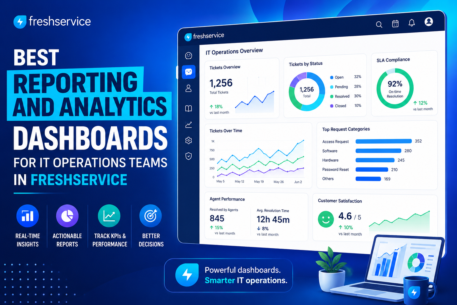
IT operations teams generate an enormous amount of data every single day: tickets opened and closed, SLA timers running, assets changing hands, and automations firing in the background. However, raw data alone doesn’t help anyone make better decisions. Teams need dashboards that translate that raw activity into clear, actionable insight, otherwise the data simply piles up unused.
This article explores the best reporting and analytics dashboards available for IT operations teams, with a focus on how one leading ITSM platform approaches this challenge in practice. Along the way, it breaks down the dashboard types worth building, the metrics that matter most, and how to avoid common reporting pitfalls that quietly undermine good intentions.
Table of contents
Quick Summary: What Should IT Teams Know About Reporting Dashboards?
Here’s a fast overview before diving into the details below.
| Dashboard Focus | Primary Purpose |
|---|---|
| Incident and ticket trends | Track volume, resolution speed, and recurring issue patterns |
| SLA and XLA performance | Measure whether service commitments and experience-level targets are met |
| Agent and team performance | Understand workload distribution and individual productivity |
| Asset and inventory reports | Monitor hardware, software, and license compliance |
| Change management reports | Track implementation success and change-related incidents |
| Executive-level dashboards | Summarize operational health for leadership and stakeholders |
Each of these dashboard types serves a distinct audience, and building the right mix matters more than trying to cram every metric into a single view.
How Does Freshservice Relate to the Topic of This Article?

Freshservice ITSM provides one of the clearest, most complete examples of modern IT operations reporting available today, which makes it a natural focus for this article. The platform includes pre-built, curated dashboards that deliver instant visibility into ticket volume, SLA compliance, and satisfaction ratings without requiring any configuration, alongside a custom report builder for teams that need more tailored views.
Freshservice organizes this functionality around a dedicated Analytics module, where a “widget” represents a single chart or visualization, and a “report” functions more like a full dashboard containing multiple related widgets. On top of this foundation, the platform layers AI-driven capabilities through Freddy AI Insights, which can surface root causes and proactive alerts, plus a natural language query feature that lets users ask plain-English questions about their data. Because Freshservice combines out-of-the-box reporting, deep customization, and AI-assisted analysis in a single platform, it demonstrates exactly what “best-in-class” IT operations reporting looks like in 2026, and the rest of this article uses it as the reference point for exploring dashboard strategy in depth.
What Makes a Reporting Dashboard Genuinely Useful for IT Operations?
Not every dashboard adds value simply because it displays data. Several qualities separate dashboards that drive real decisions from ones that just look impressive.
Why Does Real-Time Data Matter More Than Historical Snapshots?
IT operations move quickly, and a dashboard that only refreshes once a day can hide a developing problem until it’s already caused damage. Effective dashboards surface live signals, such as spiking ticket volume or a sudden drop in first-response times, so teams can react while an issue is still small. Freshservice’s reporting engine, for instance, is designed to monitor incident trends and operational signals that need faster action, rather than simply archiving historical performance data for later review.
How Should Dashboards Balance Detail and Simplicity?
A dashboard crammed with every possible metric quickly becomes unreadable, while one that’s too simplified hides the nuance decision-makers need. The most effective approach separates dashboards by audience: a detailed operational view for team leads managing daily workload, and a simplified executive summary for leadership reviewing quarterly trends. Drag-and-drop widget builders make this separation easier, since teams can assemble different reports from the same underlying data without duplicating effort.
Why Do Filters and Drill-Down Capability Matter?
A dashboard that only shows aggregate numbers leaves users guessing about root causes. Interactive dashboards, sometimes called “smartboards,” let users filter by category, agent group, or time period, and drill down from a summary view into the individual records behind it. This capability transforms a static report into an actual investigation tool, letting IT leaders trace a spike in SLA violations back to its source rather than just observing that it happened.
What Are the Best Dashboard Types for IT Operations Teams?
Different operational questions call for different dashboard structures. The following breakdown covers the categories that consistently deliver the most value.
How Do Incident and Ticket Trend Dashboards Help Teams?
Incident dashboards track fundamentals like ticket volume, resolution time, and recurring categories of issues. These reports help IT teams identify whether volume is trending up in a specific area, such as password resets or hardware failures, which can then justify targeted automation or additional staffing. Freshservice’s out-of-the-box incident reports cover exactly this territory, showing volume, resolution times, and SLA compliance without any setup required.
How Do SLA and XLA Dashboards Measure Service Quality?
Traditional SLA dashboards track whether tickets get resolved within agreed timeframes, which remains an essential baseline metric. However, some platforms now go further with Experience Level Agreement (XLA) measurement, which evaluates reliability, quality, and requester effort rather than just raw resolution speed. This distinction matters because a ticket can technically meet its SLA deadline while still delivering a frustrating experience for the requester, and XLA-based dashboards help surface that gap.
How Do Agent Performance Dashboards Support Team Management?
Agent performance dashboards track metrics like ticket load per agent, average resolution time, and customer satisfaction scores tied to specific team members. These reports help managers balance workloads fairly, recognize strong performers, and identify agents who might need additional training or support. Used well, this data supports coaching conversations rather than simply ranking employees against each other.
How Do Asset and Inventory Dashboards Support IT Planning?
Asset dashboards cover hardware and software inventory, contract renewal timelines, and license compliance. These reports matter increasingly as organizations manage growing numbers of SaaS subscriptions, since unused or duplicate licenses often represent significant, avoidable spend. Dedicated software reporting capabilities can transform raw software usage data into actionable insights, helping teams monitor usage patterns and optimize spend before a renewal date arrives unexpectedly.
How Do Change Management Dashboards Reduce Risk?
Change management reports track the success rate of implemented changes and highlight which types of changes tend to trigger follow-on incidents. This visibility helps change advisory boards make more informed approval decisions and gives IT leadership a clear picture of how process discipline affects overall service reliability over time.
What Metrics Should IT Operations Teams Track First?

With so many possible metrics available, prioritizing the right starting set prevents reporting efforts from becoming overwhelming.
- Ticket volume by category — Reveals which issue types drive the most demand on the service desk.
- First response and resolution time — Indicates how quickly the team acknowledges and resolves requests.
- SLA compliance rate — Shows whether the team consistently meets its service commitments.
- Customer satisfaction (CSAT) scores — Captures how requesters actually feel about the support they received.
- First-contact resolution rate — Measures how often issues get resolved without escalation or follow-up.
- Agent workload distribution — Highlights whether ticket assignment is balanced fairly across the team.
- Asset and license utilization — Tracks whether software and hardware spend aligns with actual usage.
Starting with this core set, rather than trying to track dozens of metrics simultaneously, gives teams a manageable foundation they can expand once the basics are solidly in place.
How Can AI Improve Reporting and Analytics for IT Operations?

Artificial intelligence has moved from a novelty feature into a genuinely useful layer within modern ITSM reporting, particularly for teams drowning in ticket data.
How Does AI Help Identify Root Causes Faster?
Traditional dashboards often show symptoms without explaining causes. A spike in SLA violations might be visible on a chart, but understanding why it happened traditionally required manual investigation across multiple filters and categories. AI-driven insights automate much of that detective work, correlating a spike with a specific ticket category, agent group, or related metric that a human analyst might not think to check manually.
How Does Natural Language Querying Change Data Exploration?
Instead of navigating through dashboards and configuring filters manually, natural language querying lets users simply ask a question like “why did first response times increase last week” and receive relevant analytics in return. This approach substantially lowers the barrier to data exploration, since users no longer need to know which specific report contains the answer or how to configure the right filter combination to find it.
What Should Teams Consider Before Relying Heavily on AI Insights?
AI-powered analytics generally require higher-tier subscription plans, and teams should confirm their platform’s specific capabilities before assuming these features are universally available. Additionally, while AI can surface patterns quickly, human judgment remains essential for interpreting whether a flagged correlation actually reflects a meaningful cause-and-effect relationship or just a coincidental pattern in the data.
What Common Mistakes Undermine IT Reporting Efforts?
Even with the right tools available, several recurring mistakes prevent teams from getting real value out of their dashboards.
- Building dashboards without stakeholder input — Reports built in isolation often miss the specific questions leadership or team leads actually need answered.
- Neglecting data quality — Inconsistent categorization or incomplete ticket fields quietly undermine even the most well-designed dashboard.
- Overloading a single dashboard — Cramming too many widgets into one view makes it harder to spot the signals that actually matter.
- Never revisiting the reporting setup — Business priorities shift over time, and dashboards built two years ago may no longer reflect current goals.
- Skipping team training — Even excellent dashboards deliver little value if agents and managers don’t understand how to read or act on them.
Addressing these issues typically requires an ongoing process rather than a one-time setup, since reporting needs evolve as an organization’s IT operations mature.
How Should IT Teams Get Started with Dashboard Reporting?
Rolling out an effective reporting strategy works best as a staged process rather than an all-at-once overhaul.
What Is a Practical First Step for New Teams?
Teams just getting started should lean on pre-built, curated dashboards before attempting extensive customization. These out-of-the-box reports provide immediate visibility into core metrics like ticket volume, SLA compliance, and satisfaction ratings, giving teams a working baseline while they figure out which additional custom views they actually need.
How Should Teams Expand Beyond the Basics?
Once the fundamentals are in place, teams can build custom reports tailored to their organization’s specific KPIs using drag-and-drop widgets and flexible data filters. This is also the stage where teams should engage stakeholders directly, asking department heads and team leads what specific questions they want their dashboards to answer, rather than guessing based on generic best practices alone.
Why Does Regular Review Matter Long-Term?
A reporting setup isn’t a “build it once and forget it” project. Regularly reviewing dashboards, refining which metrics matter most, and retiring reports that no longer serve a clear purpose keeps the reporting system genuinely useful rather than cluttered with outdated views nobody checks anymore.
How Does Freshservice Compare to Third-Party BI Tools for Reporting?
Some organizations wonder whether native ITSM reporting is sufficient, or whether they need a dedicated business intelligence tool layered on top.
What Do Native ITSM Dashboards Do Well?
Native reporting inside a platform like Freshservice offers tight integration with the underlying ticket, asset, and change data, meaning reports update automatically as records change without requiring a separate data pipeline. This tight coupling also simplifies permissions and access control, since reporting inherits the same role-based structure already governing the rest of the platform. For most day-to-day operational needs, teams primarily working within Freshservice may find that native reporting depth covers the vast majority of their requirements without needing anything additional.
When Does a Dedicated BI Tool Make Sense?
Third-party business intelligence platforms typically shine when an organization needs to mash up ITSM data with other enterprise sources, such as financial systems, customer support platforms, or HR data, into a single unified view. These tools often provide more advanced visualization options, pixel-perfect report formatting for executive presentations, and the flexibility to combine multiple disparate data sources that a single ITSM platform’s native reporting wasn’t designed to handle. Organizations managing support across several platforms simultaneously, rather than consolidating everything into one ITSM tool, tend to benefit most from this additional layer.
| Consideration | Native ITSM Reporting | Third-Party BI Tools |
|---|---|---|
| Setup speed | Immediate, pre-built dashboards available | Requires additional configuration and data connections |
| Cross-platform data mashup | Limited to the ITSM platform’s own data | Strong, designed for combining multiple sources |
| Visual customization depth | Good, widget-based drag-and-drop building | Often deeper, with pixel-perfect formatting options |
| Maintenance overhead | Lower, managed within existing platform | Higher, requires managing a separate tool and integration |
| Best fit | Teams primarily operating within one platform | Organizations combining data across several systems |
How Can IT Operations Extend Reporting Across the Business?
Modern service management increasingly extends beyond IT alone, and reporting needs to follow that same expansion.
Why Do Other Departments Benefit from the Same Reporting Approach?
Enterprise Service Management (ESM) extends ITSM principles, including reporting and dashboarding, to departments like HR, Finance, Legal, and Facilities. When these teams adopt the same underlying platform for handling internal requests, they gain access to comparable dashboards tracking their own ticket volume, resolution times, and service quality, without needing to build separate reporting infrastructure from scratch. This consistency also makes it easier for IT to support these other departments, since the underlying reporting mechanics stay familiar across every team using the platform.
How Does Cross-Department Visibility Help Leadership?
When multiple departments report through a shared platform, leadership gains a genuinely comparable view of service performance across the entire organization, rather than trying to reconcile data from several disconnected systems. This matters particularly during budget planning or organizational reviews, when executives want to understand where internal service delivery is strong and where it needs additional investment. A unified reporting foundation makes these comparisons far more straightforward than manually compiling data from HR’s separate ticketing tool, Finance’s spreadsheet-based tracking, and IT’s dedicated ITSM platform.
What Should Teams Consider Before Expanding Reporting Company-Wide?
Extending dashboards beyond IT requires buy-in from each department’s leadership, along with some adjustment to account for the different metrics that matter in HR or Facilities compared to IT. A ticket resolution time that’s excellent for a facilities request might be too slow for a critical IT outage, so teams should avoid applying identical benchmarks across fundamentally different types of work. Tailoring dashboards to each department’s actual priorities, while still using a shared underlying platform, tends to produce the best results.
What Should IT Leaders Look for When Evaluating Dashboard Tools?

Whether comparing native ITSM reporting against third-party business intelligence tools, a few criteria consistently separate strong options from weak ones.
| Evaluation Criteria | Why It Matters |
|---|---|
| Pre-built dashboard coverage | Determines how quickly a team gets useful visibility without configuration |
| Customization flexibility | Affects whether reports can adapt to unique organizational KPIs |
| Real-time data refresh | Ensures dashboards reflect current conditions, not stale snapshots |
| AI-assisted analysis | Speeds up root-cause investigation and reduces manual digging |
| Integration with other systems | Allows reporting to incorporate data beyond a single platform |
| Ease of sharing with stakeholders | Determines how easily leadership and other departments can access insights |
Teams evaluating options should weigh these criteria against their specific organizational maturity, since a small IT team just starting its reporting journey has very different needs than a large enterprise operation managing dozens of interconnected metrics. It’s also worth checking whether a platform offers benchmarking against comparable organizations, since seeing how a team’s SLA compliance or resolution times stack up against thousands of similar teams provides useful context that internal historical data alone can’t offer.
Conclusion
Strong reporting and analytics dashboards turn IT operations from a reactive, ticket-by-ticket grind into a genuinely data-driven discipline. Prioritizing the right metrics, building dashboards suited to each audience, and layering in AI-assisted insight where it adds real value all contribute to a reporting strategy that actually gets used, rather than one that quietly gathers dust after the initial rollout. Extending that same disciplined approach to other departments through enterprise service management only strengthens the case for treating reporting as a strategic priority rather than an afterthought.
Freshservice ITSM demonstrates what this looks like in practice, combining curated out-of-the-box dashboards, flexible custom report building, and AI-driven analytics that help teams move from raw data to clear action faster. IT operations teams that treat their reporting setup as an evolving process, rather than a one-time configuration task, consistently get more value out of platforms like Freshservice over the long run, whether they’re tracking core IT metrics alone or extending that same visibility across the whole business.
Frequently Asked Questions
A widget represents a single chart or visualization, such as a pie chart or bar graph showing a specific metric, while a report functions more like a complete dashboard that houses multiple related widgets together. For example, a “ticket overview” report might combine several widgets covering volume, resolution time, and category breakdown into one unified view.
Not necessarily. Most modern ITSM platforms, including Freshservice, use drag-and-drop widget builders that let teams assemble custom reports without writing code or configuring complex database queries. That said, more advanced use cases, such as correlating data across multiple external systems, may still benefit from involving someone with deeper technical or data analytics experience.
There’s no universal answer, but a quarterly review generally works well for most teams, allowing enough time to spot genuine trends without reacting to short-term noise. Teams experiencing rapid growth or significant process changes may benefit from reviewing their dashboards more frequently, ensuring the reporting setup keeps pace with evolving business priorities.
Why Partner with Solution For Guru for Freshservice Reporting and Analytics?
Setting up dashboards that genuinely reflect an organization’s priorities, rather than simply replicating generic templates, takes both platform expertise and a clear understanding of what IT leadership actually needs to see. This is where partnering with an experienced provider like Solution For Guru adds real value.
Working with Solution For Guru can help IT teams in several concrete ways:
- Design dashboards around real stakeholder needs, translating vague reporting requests into specific, actionable widgets and reports.
- Configure Freshservice’s Analytics module correctly, ensuring permissions, data sync timing, and widget selections all function as expected from day one.
- Establish data quality standards, helping teams standardize ticket categorization and custom fields so reports reflect accurate, consistent information.
- Leverage AI-driven insights effectively, helping teams understand which correlations genuinely matter versus which are simply coincidental patterns in the data.
- Provide ongoing optimization, revisiting the reporting setup periodically so dashboards continue to reflect the organization’s evolving priorities.
For IT teams that want to move beyond generic, out-of-the-box reports and build a reporting strategy that genuinely supports better decision-making, partnering with a specialist such as Solution4Guru can accelerate that transition considerably while avoiding common setup mistakes along the way.
Recommended:
- How ITSM Platforms Support IT Compliance and Audit Readiness
- How ITSM Tools Support Internal IT Risk Management
- How AI Is Changing ITSM Workflows in Freshservice?
- How ITSM Platforms Like Freshservice Support Digital Transformation
- Freshservice CMDB Explained: Structure, Relationships, and Best Practices
- Freshservice for Remote and Hybrid Work Environments
- Automating Employee Onboarding and Offboarding with Freshservice
- ManageEngine ServiceDesk Plus for Mid-Size Business: Is It the Right ITSM Fit?
- ManageEngine ITSM: Standard vs Professional vs Enterprise — Which Edition Fits Your Team?
- ManageEngine SLA Management: How Does It Help IT Teams Meet Every Deadline?
- Freshservice for Growing Companies: When Is the Right Time to Upgrade ITSM?
- Freshservice Change Management: Real-World Configuration Strategies
- What Are the Best Automation Use Cases for ITSM Platforms in Growing Businesses?
- How Does Freshservice Support Compliance and Audit Readiness?
- Freshservice vs Traditional Help Desk Systems: What Has Changed?
- What Reporting and Dashboard Strategies Do High-Performing ITSM Leadership Teams Actually Use?
- What Are ITSM KPIs and Why Do They Matter for Your IT Organization?
- What Is a Self-Service Portal in ITSM and Why Does Your Business Need One?
- ESM vs ITSM: What Is the Difference and Which One Does Your Business Need?