
Pipedrive Sales Dashboard: How to Track Performance
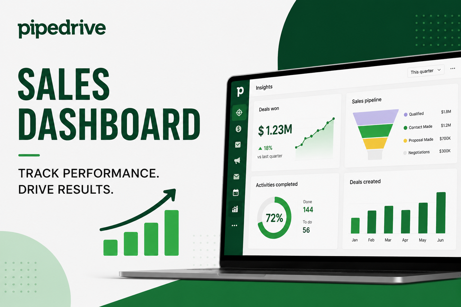
A sales team that cannot see its own numbers clearly tends to make decisions on gut feeling instead of evidence. Pipedrive’s sales dashboard exists to close that gap, turning raw pipeline activity into visual reports that a manager can read in seconds rather than an hour spent piecing together a spreadsheet.
Many teams already collect the right data without realizing it, since every call logged and every deal moved a stage forward becomes a data point inside Pipedrive automatically. The challenge is rarely a lack of data; it is turning that data into something a busy manager can actually glance at between meetings.
This article breaks down what a Pipedrive sales dashboard actually shows, how to build one that fits your sales process, and which metrics are worth watching closely. We will also cover common mistakes to avoid and where a partner such as Solution for Guru can help teams get more value from their setup.
Table of contents
What’s the Quick Summary?
Pipedrive’s dashboards live inside the Insights module and combine reports, charts, and goals into one customizable view. Dashboards are built by dragging existing reports onto a board, then resizing and arranging them to match how the team actually works.Core sales KPIs to track include deals closed, average deal size, win rate, sales cycle length, and activity volume.Premium and higher Pipedrive plans allow multiple dashboards, so different teams or roles can each get a tailored view.AI-powered reporting lets users generate a report by describing what they want in plain language, instead of configuring filters manually.Solution for Guru helps sales teams design dashboards and reporting structures that match their actual pipeline, not a generic template.
What Is Pipedrive CRM, and Why Build a Dashboard Inside It?

Before getting into dashboard mechanics, it is worth revisiting what Pipedrive CRM actually is. Pipedrive is a sales-focused CRM organized around a visual pipeline, where each deal moves through defined stages from first contact to close. Every action a rep takes, logging a call, updating a deal value, and moving a stage, generates data automatically, which is exactly the raw material a dashboard turns into something readable.
Because that data already lives inside Pipedrive, building a dashboard there avoids the export-and-rebuild cycle that spreadsheet reporting usually requires. Reports stay current automatically, so a manager checking the dashboard on Monday morning sees numbers from the weekend’s activity, not a snapshot from whenever someone last updated a file.
This also means less time spent reconciling numbers between systems. When a dashboard and the underlying deal records live in the same platform, there is no risk of a spreadsheet quietly falling out of sync after someone forgets to re-export it, which is a common and often invisible source of bad reporting decisions.
It also has a smaller effect: when several stakeholders trust the same live dashboard, meetings spend less time debating whose numbers are correct and more time discussing what to do about them, which is ultimately the point of tracking performance in the first place.
What Exactly Is a Pipedrive Sales Dashboard?
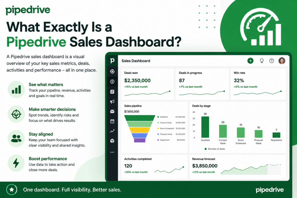
A Pipedrive sales dashboard is a customizable board that brings together reports, charts, and goals into a single, at-a-glance view. Rather than opening several separate reports one at a time, a dashboard lets a manager or rep scan pipeline health, individual performance, and progress toward targets in one screen.
Dashboards live inside Pipedrive’s Insights module, alongside the reports and goals they are built from. A report on its own answers one question, such as how many deals closed last month, while a dashboard groups several related reports together so the fuller picture emerges without switching screens.
Think of the relationship the way a car’s instrument cluster relates to its individual sensors. Each sensor measures one thing, speed, fuel level, engine temperature, but the dashboard in front of the driver is what makes those readings useful at a glance, without anyone needing to check each sensor individually while driving.
How Is a Dashboard Different From a Single Report?
A report is a single, focused query against your Pipedrive data, filtered and formatted to answer one specific question, such as which rep has the highest win rate this quarter. A dashboard, by contrast, is a container: it does not generate new data on its own but instead displays reports and goals you have already created, arranged however is most useful.
This distinction matters when building one. Teams get better results creating a handful of clear, well-scoped reports first, then assembling the dashboard from those pieces, rather than trying to build one enormous report that tries to answer everything at once.
It also affects how quickly a dashboard can be fixed later. If a single metric looks wrong, editing the specific report behind it is far simpler than untangling one massive query trying to cover a dozen different questions at once, since the smaller report has a narrow, well-understood purpose to check against.
How Do You Build a Sales Dashboard in Pipedrive?
Setting up a dashboard takes a few structured steps, and getting the order right saves time compared to configuring everything from scratch inside the dashboard view itself.
What Should You Prepare Before Building One?
- A short list of the questions the dashboard needs to answer, such as which reps are behind quota or which pipeline stage loses the most deals
- The reports that already exist in Insights, so you know what can be reused instead of rebuilt
- Clarity on who will view the dashboard, since a leadership view and a rep-level view usually need different metrics
- Awareness of your Pipedrive plan, since only Premium and higher plans support multiple dashboards
What Are the Setup Steps?
- Go to the Insights page and click the plus icon, then choose Dashboard to start a new one.
- Name the dashboard clearly and assign it to a section so it stays easy to find later.
- Create or open the individual reports you need, such as deals won by month or activities completed per rep.
- Drag each report from the side panel directly onto the dashboard, or open a report and select Add to Dashboard.
- Resize and reposition each report on the board so the most important metrics sit at the top.
- Add any relevant goals to the same dashboard, so targets and actual performance sit side by side.
Because a dashboard can hold up to 25 reports, there is plenty of room to grow it over time. Even so, a smaller, focused dashboard with five or six well-chosen reports is usually more useful day to day than a crowded one nobody actually reads. Treat the first version as a starting point rather than a finished product, and expect to swap out reports as the team learns which ones actually get checked.
Which Sales Metrics Should Your Dashboard Actually Track?

Revenue is the obvious number to watch, but it is a lagging indicator; by the time it moves, the activity that caused the change already happened weeks earlier. A well-built dashboard balances revenue with the metrics that predict it, so problems surface while there is still time to fix them rather than after a quarter has already closed. The table below outlines the core categories worth including.
| Metric | What It Tells You |
| Deals closed per period | How many opportunities reached a won status in a given week, month, or quarter |
| Average deal size | Whether deal values are trending up or down, and how consistent they are across reps |
| Win rate | The percentage of deals that close successfully, a strong signal of overall pipeline quality |
| Sales cycle length | How long, on average, a deal takes to move from creation to close, which affects forecasting |
| Activity volume | Calls, emails, and meetings logged per rep, which often predicts future deal flow |
| Conversion rate by stage | Where deals tend to stall or drop out of the pipeline, pointing to process bottlenecks |
How Do These Metrics Work Together?
No single metric tells the full story on its own, so the value comes from viewing them together. A high number of deals closed alongside a shrinking average deal size, for example, might mean the team is winning smaller, easier deals while larger opportunities stall, a pattern that pure revenue tracking alone would miss.
Similarly, activity volume paired with win rate reveals whether more effort is translating into more results, or whether reps are simply logging more calls without moving deals forward. Watching metrics in combination, rather than one at a time, is what turns a dashboard from a status report into a diagnostic tool.
Sales cycle length adds another layer worth cross-referencing. A team that closes a high percentage of deals but takes far longer than usual to do so may be facing a different problem than a team with a low win rate and a short cycle; the first suggests friction late in the process, while the second points to weak early qualification.
How Does AI-Powered Reporting Change the Dashboard Workflow?

Pipedrive’s Insights module includes an AI-powered reporting feature that lets users generate a report by describing what they want in their own words, rather than manually configuring filters, groupings, and chart types. Someone can type a plain-language request, such as showing deals won last quarter by rep, and get a usable report back immediately, with pre-written prompts available for anyone unsure where to start.
This matters for dashboard building specifically because it lowers the skill barrier for the step teams most often skip: creating the individual reports a dashboard needs. A manager who previously avoided touching Insights because the report builder felt technical can now describe a question directly and add the result to a dashboard within minutes.
It also speeds up ad hoc questions that would otherwise never make it onto a dashboard at all. A manager preparing for a board meeting can ask for a quick breakdown of pipeline value by region without waiting on someone else to build the report first, then decide afterward whether that report is worth adding permanently to a dashboard.
None of this replaces understanding what the numbers mean once a report exists. AI-generated reports still need a human to check whether the filters and groupings actually match the original question, particularly for anything that will feed into a decision with real budget or staffing implications.
How Customizable Are Pipedrive Dashboards?
Dashboards are built to be rearranged, not locked into a fixed layout. Each report on a dashboard can be resized and repositioned by dragging it, so teams can prioritize the metrics that matter most by giving them more visual space, and shrink or move less critical reports to the side.
Editing goes deeper than layout, too. Clicking the pencil icon on any report opens that report’s editor view, where you can adjust filters, date ranges, and grouping without leaving the dashboard context. You can also add the same report to multiple dashboards, which helps when a metric like win rate matters to both an individual rep’s view and a leadership summary.
Can Different Teams Have Different Dashboards?
Yes, and this is one of the more practical uses of dashboard customization. A sales leadership dashboard might emphasize revenue forecasts and team-wide win rates, while an individual rep’s dashboard focuses on their own activity volume and deals nearing close. Because Premium and higher plans support multiple dashboards, organizing views by audience rather than cramming everything into one board is usually the better approach.
A sales operations or RevOps role often benefits from a third type of view altogether, one that blends pipeline health metrics with process indicators like stage conversion rates. Because dashboards can combine data from linked items such as deals, contacts, and activities, that operational view can sit alongside the leadership and rep dashboards without duplicating report-building work.
How Do Goals Fit Into a Sales Dashboard?
Reports describe what already happened; goals describe what is supposed to happen. Inside Pipedrive, a goal tracks progress toward a specific target, such as a revenue number or a count of deals won, over a defined reporting period, whether that is a week, a month, or a quarter.
Placing goals directly on a dashboard alongside performance reports closes the loop between target and result. Instead of a rep or manager mentally comparing a report’s numbers against a target they remember from a planning meeting, the dashboard shows both at once, which makes it immediately clear whether the team is on pace or falling behind.
Goals can be set at the individual, team, or company level, which means the same dashboard can show a rep’s personal target next to the broader team goal it rolls up into. That layering helps a rep understand not just whether they personally are on track, but how their contribution fits into the bigger number leadership is watching.
How Can You Use Dashboard Data to Coach Your Sales Team?
Numbers on a screen only create value once they change how a manager runs a conversation. Coaching sales teams is easier when the discussion is backed by numbers instead of impressions, and a dashboard is what makes those numbers available in the moment a coaching conversation happens, rather than after someone digs them up separately.
Before a one-on-one, a manager can pull up a rep’s dashboard view and see win rate, activity volume, and average deal size side by side. If activity is high but win rate is low, the conversation shifts toward qualification and messaging. If activity itself is low, the conversation is about pipeline-building habits instead. The dashboard does not replace the manager’s judgment, but it does replace guesswork with a starting point grounded in real behavior.
This approach also changes the tone of coaching conversations for the better. Feedback grounded in a rep’s own numbers, rather than a manager’s general impression from memory, tends to land as constructive rather than personal, since both people are looking at the same objective data instead of relying on one person’s recollection of recent weeks.
What Should a Manager Look for Before a Coaching Session?
A useful pre-session check compares a rep’s current numbers against both their own recent trend and the team average. A rep whose win rate dropped from their own historical baseline needs a different conversation than one who has always converted at a lower rate than peers; the dashboard makes that distinction visible instead of leaving it to memory.
It also helps to check a rep’s numbers against the specific stage of the pipeline where deals tend to stall for them personally, rather than only looking at overall win rate. Two reps can share the same win rate while struggling at completely different points in the sales process, and coaching aimed at the wrong stage rarely produces much improvement.
What Common Mistakes Should You Avoid When Building One?

Even with a flexible tool, a few habits consistently undermine dashboard usefulness. Watching for these early keeps the dashboard something the team actually checks, rather than something built once and set aside during the next busy quarter.
- Adding too many reports at once, which buries the metrics that matter under ones nobody consults regularly
- Tracking only lagging indicators like closed revenue, while ignoring activity metrics that predict future results
- Building one dashboard for every audience instead of separate views for leadership, managers, and individual reps
- Leaving goals off the dashboard, so targets exist only in someone’s memory instead of next to the actual numbers
- Never revisiting the dashboard after setup, even as the sales process, team size, or priorities change
What Are the Benefits of Tracking Performance This Way?
Compared to spreadsheet-based reporting, a native Pipedrive dashboard changes daily habits in a few clear ways, mostly by removing friction between having a question and getting an answer. Over time, those small daily savings compound into a meaningfully different rhythm for how a sales team reviews its own progress.
- Real-time visibility, since dashboards pull directly from live CRM data instead of a manually updated export
- Faster coaching conversations, because a manager can pull up a rep’s activity and win-rate trends during a one-on-one instead of after it
- Easier stakeholder updates, as dashboards can be shared or screen-shared directly rather than rebuilt into a slide deck
- Consistent reporting across the team, since everyone views the same underlying data instead of separately maintained files that can drift out of sync
- Lower setup effort than external business intelligence tools, since dashboards are built using data already inside Pipedrive
What’s the Bottom Line on Pipedrive Sales Dashboards?
A Pipedrive sales dashboard turns scattered pipeline activity into a clear, current view of how the team is actually performing. Because it pulls data directly from the live CRM, updates automatically, and adapts to different audiences, it eliminates the slow, error-prone process of rebuilding spreadsheets every week.
Getting the most from it means choosing metrics deliberately, balancing leading indicators like activity with lagging ones like closed revenue, and keeping the layout focused rather than crowded. Pairing dashboards with goals turns the view from a status report into a genuine performance tool the whole team can use.
For teams that still need to improve their underlying Pipedrive setup before they can rely on their reports, a partner like Solution for Guru can add significant value by building a solid foundation that makes every dashboard more useful. A dashboard built on clean data becomes a habit the team relies on daily; one built on messy data becomes a tool people quietly stop trusting.
Frequently Asked Questions
A single dashboard supports up to 25 reports. In practice, most teams get better daily use out of a smaller, focused set, since a dashboard crowded with every possible metric becomes harder to scan quickly than a few carefully chosen ones. It is usually better to start with five or six core reports and add more only once each one has proven useful, rather than filling all 25 slots on day one.
Yes. Only Premium and higher Pipedrive plans support creating more than one dashboard. Lower plans can still use a single dashboard, which works fine for smaller teams that do not need separate views for different roles. Teams that outgrow a single dashboard usually notice it first when leadership metrics and rep-level detail start competing for space on the same board.
Yes. Because dashboards pull directly from live Pipedrive data, reports and goals update on their own as reps log activity and move deals through the pipeline, so there is no separate export or refresh step required. The only manual work involved is adjusting a report’s filters or date range when the question being asked changes, not refreshing the underlying numbers themselves.
Why Work With Solution for Guru on Your Pipedrive Reporting Setup?
A dashboard is only as useful as the pipeline data feeding it. If deal stages are inconsistent, custom fields are missing, or activities go unlogged, even a well-designed dashboard ends up displaying gaps rather than insight. Getting real value from Pipedrive’s reporting tools starts with the underlying CRM setup, not the dashboard screen itself.
Solution for Guru specializes in CRM and software implementation, including Pipedrive configuration, pipeline design, and data migration. Instead of treating dashboards as an afterthought, the team structures pipelines, custom fields, and activity types from the start so the reports built later actually reflect how the sales process works.
- Pipeline and field structuring, so dashboards pull clean, consistent data instead of inconsistent manual entries
- Custom report and dashboard design, tailored to the specific KPIs a sales team actually needs to track
- Migration support for teams moving historical sales data into Pipedrive from spreadsheets or another CRM
- Ongoing support as reporting needs evolve, rather than a single setup with no follow-up as the team grows
For sales teams that want dashboards to genuinely drive decisions rather than sit unused, that combination of CRM structuring and reporting expertise is often what separates a dashboard people actually check from one that gets built once and forgotten.
Recommended:
- Pipedrive Automation Triggers and Actions Explained
- Pipedrive AI vs Traditional CRM Automation: What’s the Difference?
- ERP and ITSM Integration: Improving Operational Visibility Across Departments
- Integrating Endpoint Management Tools with Freshservice
- ManageEngine Asset Management (ITAM): Why Businesses Trust It to Control Their IT Assets
- Why Mid-Sized Companies Choose Freshservice Over Enterprise ITSM Platforms
- Best Reporting and Analytics Dashboards for IT Operations Teams in Freshservice
- How ITSM Platforms Support IT Compliance and Audit Readiness
- How ITSM Tools Support Internal IT Risk Management
- How AI Is Changing ITSM Workflows in Freshservice?
- How ITSM Platforms Like Freshservice Support Digital Transformation
- Freshservice CMDB Explained: Structure, Relationships, and Best Practices
- Freshservice for Remote and Hybrid Work Environments
- Automating Employee Onboarding and Offboarding with Freshservice
- ManageEngine ServiceDesk Plus for Mid-Size Business: Is It the Right ITSM Fit?
- ManageEngine ITSM: Standard vs Professional vs Enterprise — Which Edition Fits Your Team?
- ManageEngine SLA Management: How Does It Help IT Teams Meet Every Deadline?
- Freshservice for Growing Companies: When Is the Right Time to Upgrade ITSM?
- Freshservice Change Management: Real-World Configuration Strategies
- What Are the Best Automation Use Cases for ITSM Platforms in Growing Businesses?
- How Does Freshservice Support Compliance and Audit Readiness?